Section Shop

Browse by category

164 sections across 13 categories — each one native to your theme editor.

Shoppable Video & Stories

Product-linked videos, story bubbles and reels that bring products to life.

All 9 →
Preview of the Shoppable Stories Shopify section Free

Shoppable Stories

40 installs

Shoppable Video & Stories

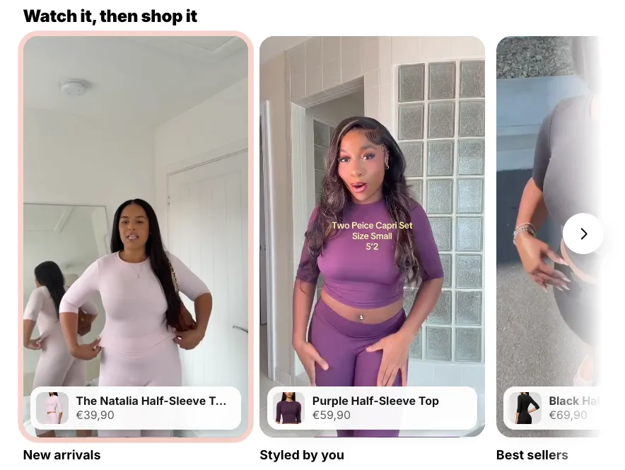
Short videos that sell, as story bubbles or vertical reels. Previews play silently while on screen; a tap opens a full-screen player with progress bars, sound, and a swipe from one video to the next, and beside each video (over it on phones) sit the products it shows — options, price and an add to cart that never leaves the video. On a product page the stories can sit right inside the product details: under or above the buy buttons, under the title or under the description, and a video left without products sells the product of the page. No external libraries.

View section →
Preview of the Video Quick Shop Shopify section Free

Video Quick Shop

16 installs

Shoppable Video & Stories

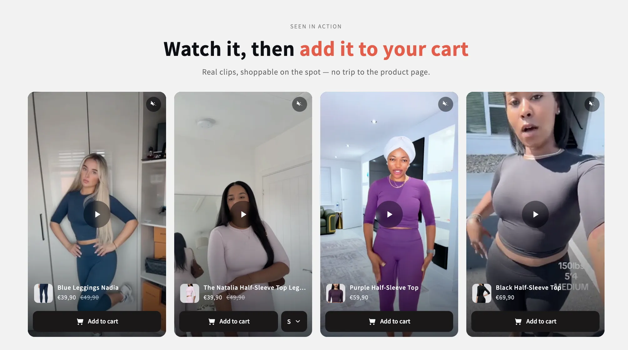
Shoppable clips that sell without leaving the page: each card carries its product, its variants and an add-to-cart, and opens full size in a popup with the description. Supports uploaded video or YouTube and Vimeo.

View section →
Preview of the Shoppable Slider Shopify section Free

Shoppable Slider

15 installs

Shoppable Video & Stories

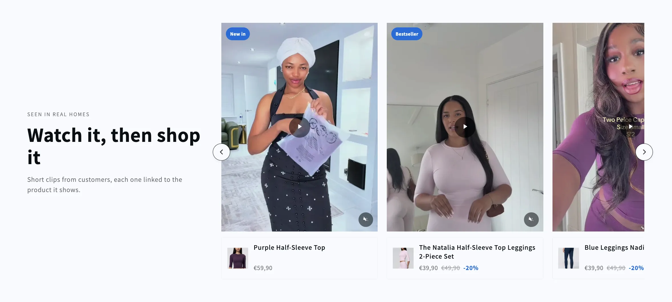
A headline beside a side-scrolling row of shoppable clips. Each video carries the product it shows, with its image, name and price in a card below, and the row keeps its card size however few clips are left.

View section →

Collection Showcases

Collection cards, circles and editorial grids to help shoppers find their next favorite.

All 9 →
Preview of the Collection Grid Shopify section Free

Collection Grid

Collection Showcases

Replaces your theme's own product grid on a collection page: products, sorting and pagination, with the caption rows built from blocks you can reorder or remove. Every card in a row shares an identical height, photo bottom, name top and button top, because the vendor and rating rows are decided once for the whole grid rather than card by card.

View section →
Preview of the Shop Collections 7 Shopify section Free

Shop Collections 7

29 installs

Collection Showcases

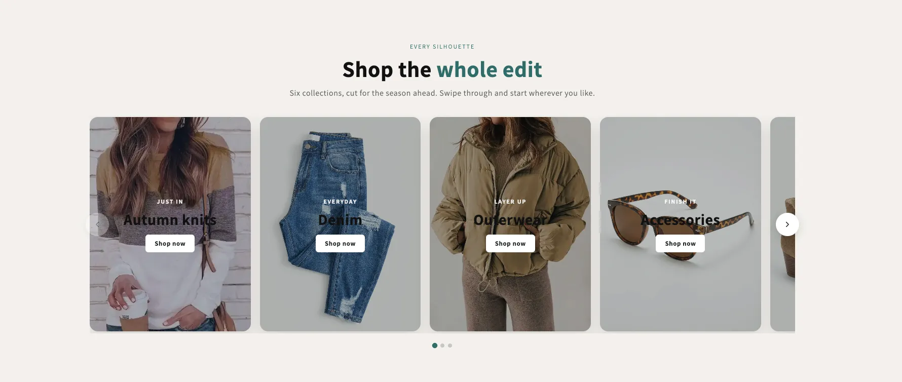
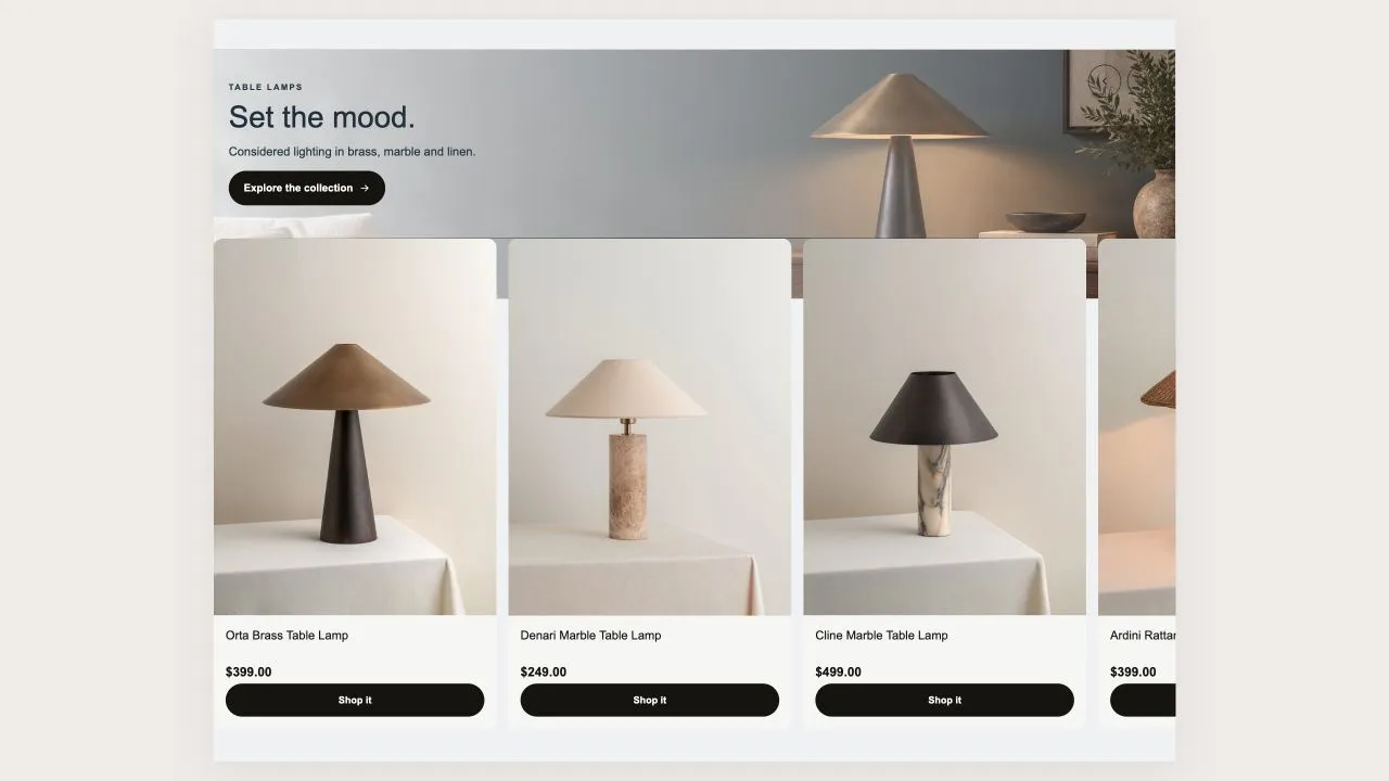
A rail of full-bleed collection cards with the copy laid over the photo, positioned in any of nine spots — set separately for desktop and phones. Optional autoplay, dots and arrows, each toggled per screen size.

View section →
Preview of the Shop Collections 6 Shopify section Free

Shop Collections 6

19 installs

Collection Showcases

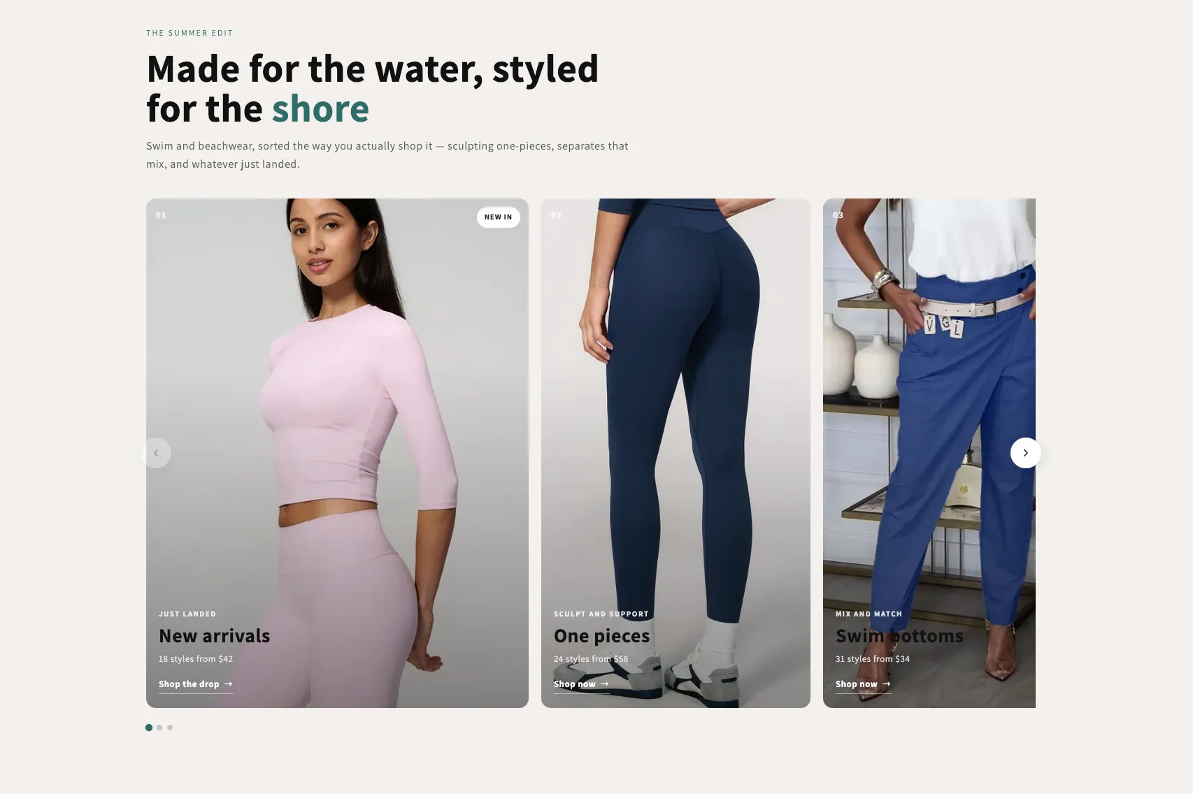
An editorial rail of collection cards with a numbered index, a badge, a kicker, a title and a meta line over a graded photo. One grade across mismatched photography makes the set read as one. Optional autoplay with a real pause control.

View section →

Headers & Navigation

Headers and navigation layouts with room for your collections and brand.

All 4 →
Preview of the Island Header Shopify section Free

Island Header

Headers & Navigation

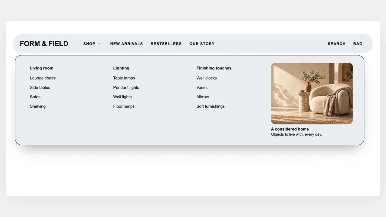
A floating, rounded header that sits on the page like an island: the menu on one side, your logo in the middle (or first, with the space beside it yours to set), search, account and cart on the other. A pill glides between menu items and rests on the page being viewed; drop-downs open as a card sized to their links, as wide as the island or across the whole screen, show each collection's picture in front of its link (square, rounded or round, as you set), group three-level menus and hold stacked pictures or banners on either side of the links. Any menu item can wear a small label such as HOT or NEW in your colours, with a twinkling icon if you like: above the name on computers, beside it on phones. The phone menu can show the same pictures, opens each sub-menu on the item's name, on "All" in the shopper's language or on words of your own, and places pictures, short texts and your own code above or below the links of the item they belong to; a Custom code block also takes CSS to restyle anything in the header. Search opens a panel with quick links, then live results as product cards with photo and price. Shoppers sign in through Shopify's own account button — with Shop, Google, Facebook or a code by email, without leaving the page — and choose their country (and so their currency) and language in a compact panel with a search box for long lists, or in two rows at the foot of the phone menu. The cart, with your own icon if you like, opens a drawer of its own — quantities, discounts, subscriptions, a free-shipping progress bar and checkout — that keeps working with your theme's header switched off and can open by itself after an add to cart. It can float see-through over your first section and turn solid once past it, stays pinned as the page scrolls (slimmer, or hiding on the way down), and works out every quiet tone from your colours with contrast checked.

View section →
Preview of the Mega Search Header Shopify section Free
Mega Search Header

Headers & Navigation

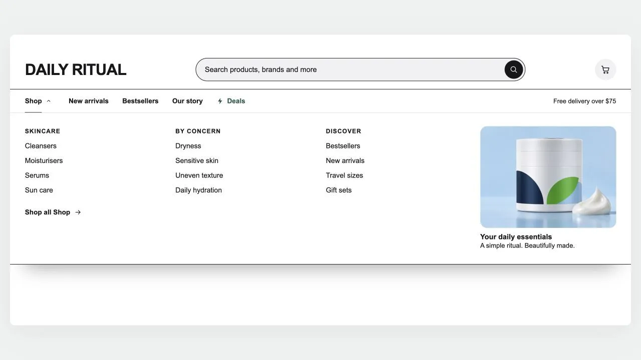
A header built around search, for large catalogues: a wide search bar with a product-type picker and live suggestions (matching searches first, then products with photo and price), and a menu row whose items open panels across the full width, as wide as the page, or as a card sized to their links — headed columns for three-level menus, each collection's picture in front of its link (square, rounded or round, as you set), a "Shop all" link, and stacked pictures or banners on either side of the links. Any menu item can wear a small label such as HOT or NEW in your colours, with a twinkling icon if you like. A deal link shines in your accent colour, and the cart can wear your own icon. Shoppers sign in through Shopify's own account button and choose their country (and so their currency) and language in a compact panel with a search box for long lists. It stays on top as the page scrolls (slimmer, hidden on the way down, or down to the menu row alone), keeps the cart count right after any add to cart, and becomes a side-sheet menu on phones with its own search row, the same pictures and labels, short texts and your own code above or below each item's links, and the first link of each sub-menu worded as you like. Every in-between tone is computed from your colours and checked for contrast.

View section →
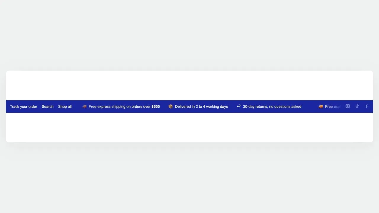
Preview of the Utility Bar 1 Shopify section Free
Utility Bar 1

Headers & Navigation

A three-zone top rail: quick links on the left, a scrolling message in the middle, and country, language and social links on the right. Only the middle moves, so the links and the country picker stay clickable. The softer divider tone is worked out from your text colour and measured against the background, so recolouring the bar cannot quietly drop it below a readable contrast.

View section →

Hero & Banners

First-impression sections: hero layouts, promotional banners and rotating showcases that make visitors stop scrolling.

All 27 →
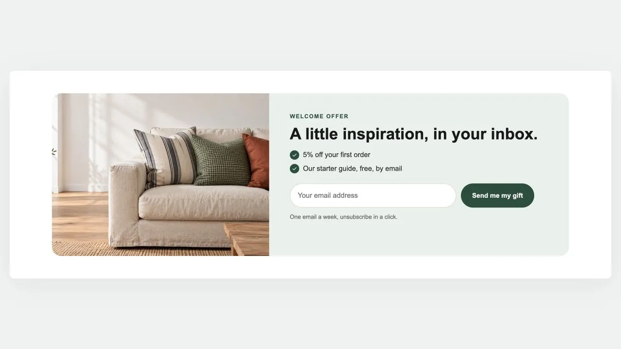
Preview of the Newsletter Band 1 Shopify section Free
Newsletter Band 1

Hero & Banners

A sign-up band with an offer: a heading, three perks with a tick, the email field and the button, a photo beside it if you like. Subscribers get the newsletter tag; the thank-you shows in place.

View section →
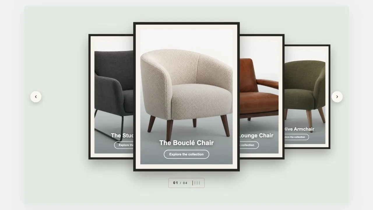
Preview of the Coverflow 2 Shopify section Free
Coverflow 2

Hero & Banners

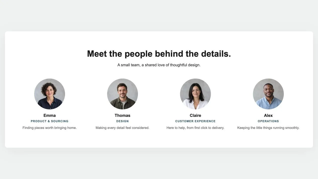
A gallery wall: each photograph sits in a mat and a frame, hung in a row that recedes to either side of the one in front. Navigation is a brass plaque with the piece number and a row of tick marks, the way a wall label works. Hangs flat by default, and leans as far as you want it to.

View section →
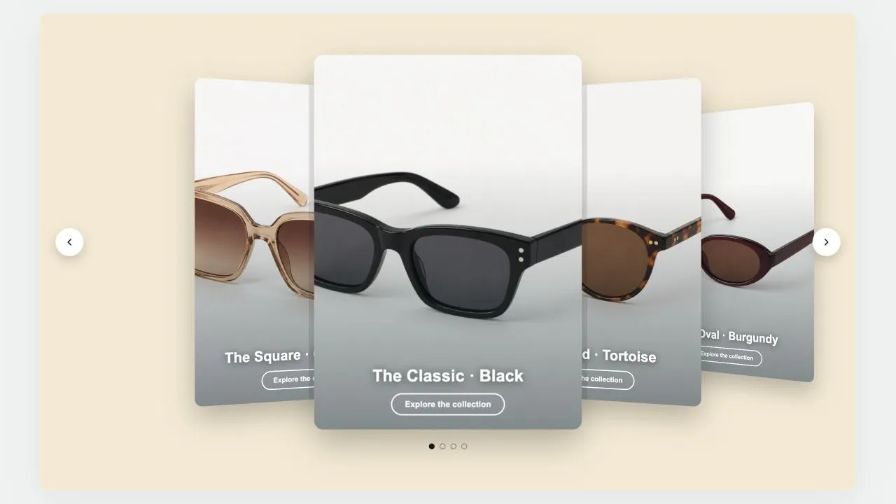
Preview of the Coverflow 1 Shopify section Free
Coverflow 1

Hero & Banners

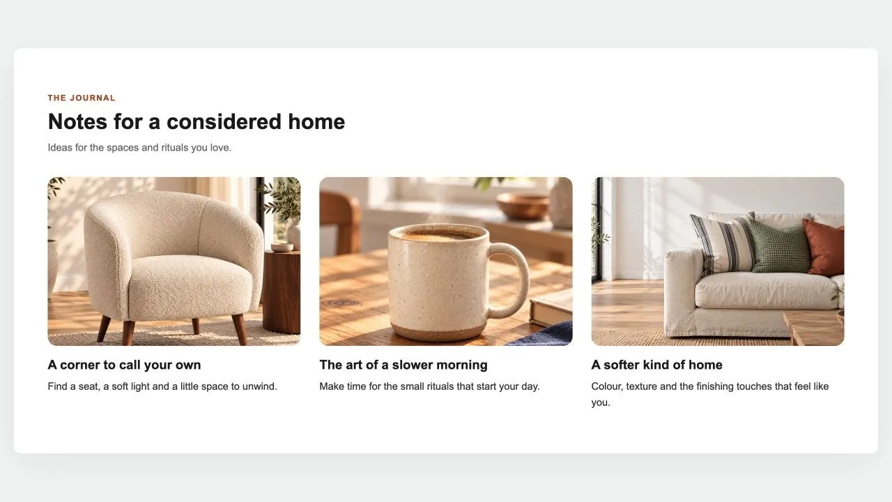
A leaning deck of cards: one in front, its neighbours fanned out behind and shrinking with distance. Each card carries a signed offset from the centre as a CSS custom property and one transform rule reads it, so moving the deck rewrites numbers rather than markup. Clicking a card behind brings it forward.

View section →

Image with Text

Story-telling layouts pairing visuals with copy — splits, overlays, zigzags and card grids for brand and product stories.

All 15 →
Preview of the Stat Rings 1 Shopify section Free
Stat Rings 1

Image with Text

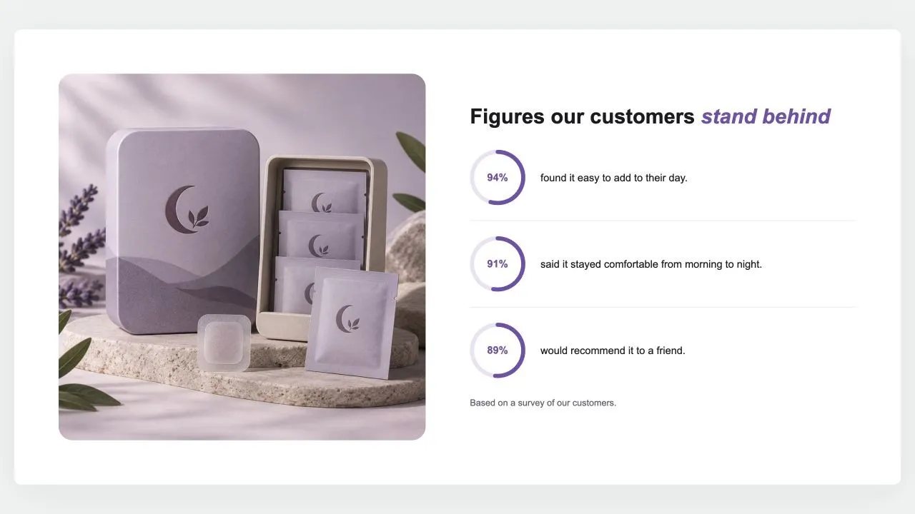
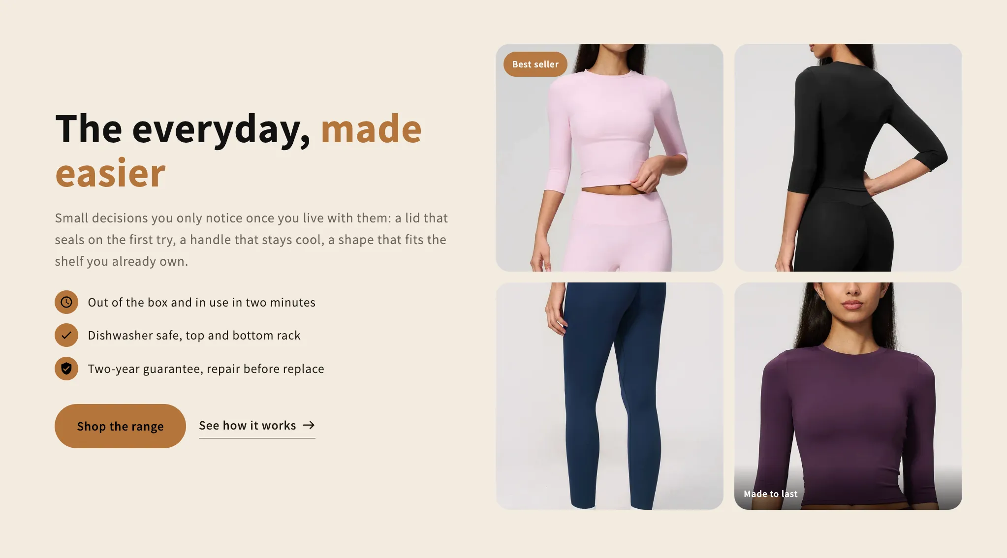
A photo beside a heading and up to six figures, each a ring filled to its percentage with the number inside and a line of text. The rings fill as they scroll into view, and a note says where the figures come from.

View section →
Preview of the Guarantee Band 1 Shopify section Free

Guarantee Band 1

Image with Text

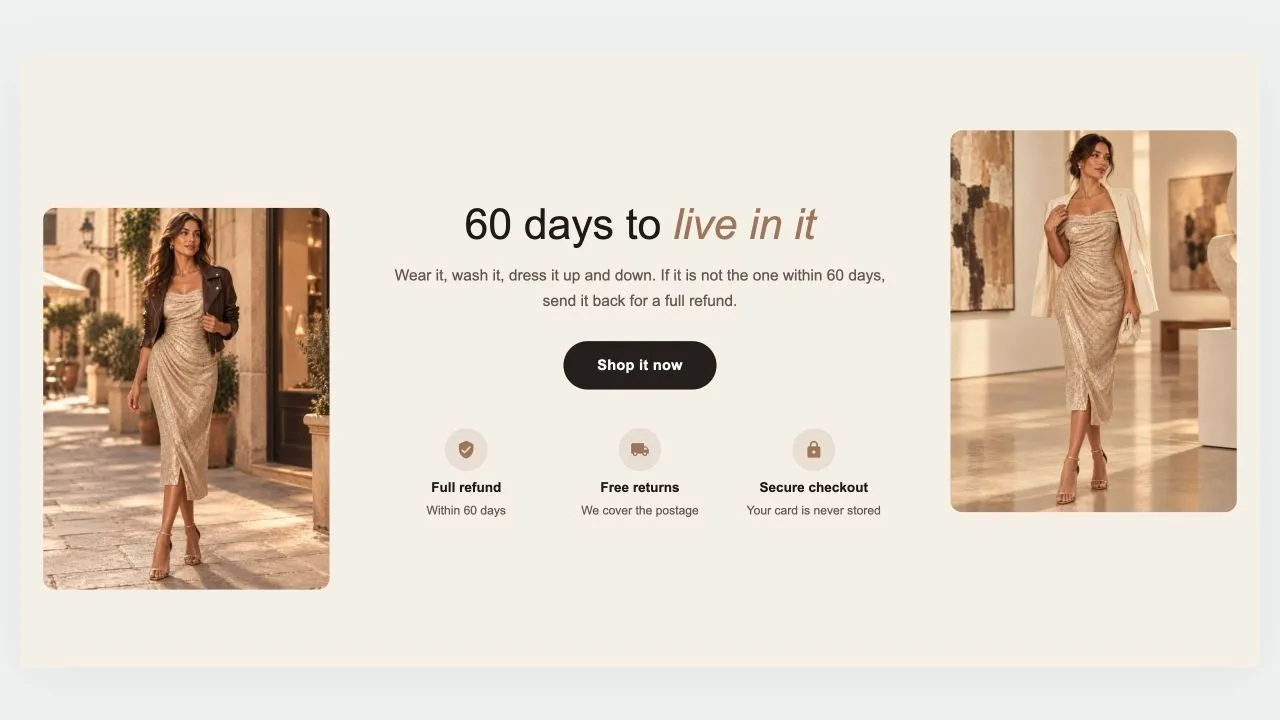
A guarantee told between two photos: a heading, a short promise and a button in the middle, a row of reassurances underneath, and a picture on each side, staggered for a little movement. On phones the photos sit side by side above the words, or step aside altogether.

View section →
Preview of the Ingredient Tabs Shopify section Free

Ingredient Tabs

Image with Text

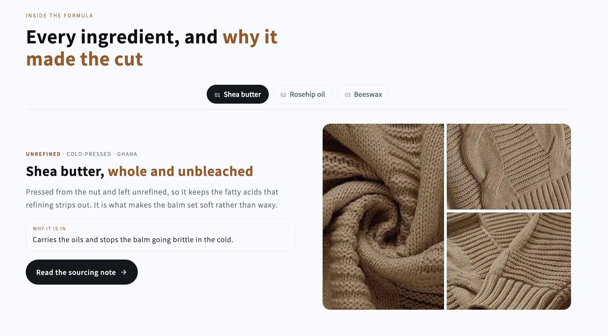
A tab bar that swaps both the picture and the copy: one panel per ingredient, material or step, each with its own credential line, reason and link. Full keyboard navigation.

View section →

Announcement Bars

Marquees, tickers and rotating bars that push promotions, shipping thresholds and urgency without touching your theme.

All 14 →
Preview of the Marquee 4 Shopify section Free

Marquee 4

Announcement Bars

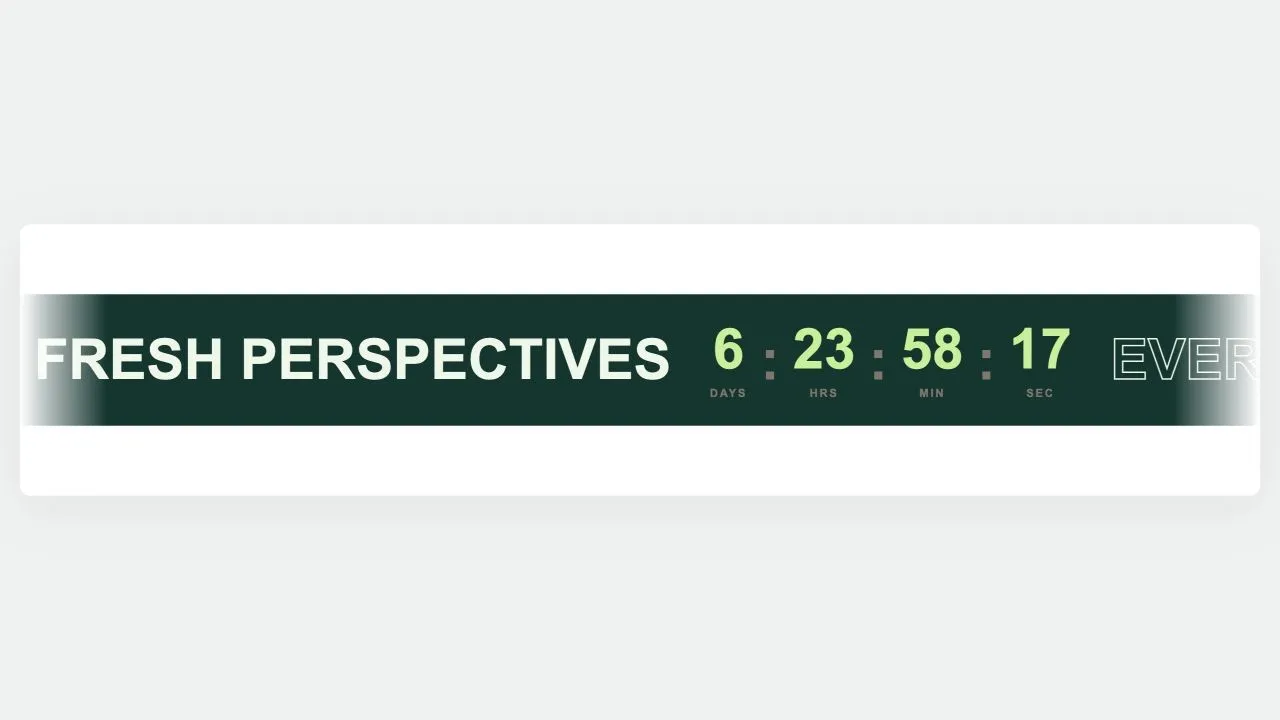
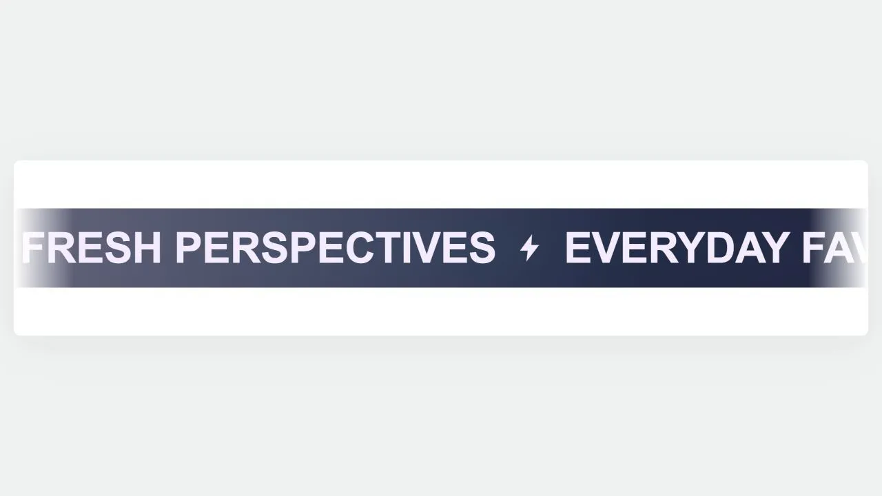
A scrolling band that can carry words, images, buttons and a live countdown together. The digits use tabular figures and the days field reserves the width it needs at render time, so a tick can never change the set width and jog the loop. The clock is worked out server-side first, so the numbers are right at first paint.

View section →
Preview of the Marquee 3 Shopify section Free

Marquee 3

Announcement Bars

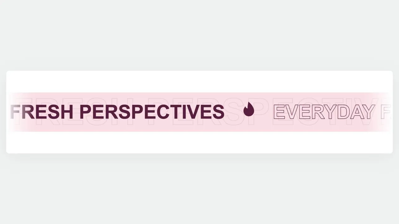
A sale marquee with depth: a faint oversized ghost of the same words drifts behind at half speed, and the emblems bob gently in place. Words alternate filled and hollow, which is what gives the band its rhythm without needing a second colour. An emblem set to turn keeps turning, because spin and bob both animate the same property.

View section →
Preview of the Marquee 2 Shopify section Free

Marquee 2

Announcement Bars

A holographic drop band for launches and restocks. One glow palette retunes the background, the words and the emblems together, with a Custom option for your own colours. A slow band of light drifts across behind the words, and stops for anyone who asks for reduced motion.

View section →

Countdown Timers

Deadline-driven sections for launches, drops and sales — hero countdowns, boxed timers and product-launch layouts.

All 15 →
Preview of the Countdown Drop 1 Shopify section Free

Countdown Drop 1

Countdown Timers

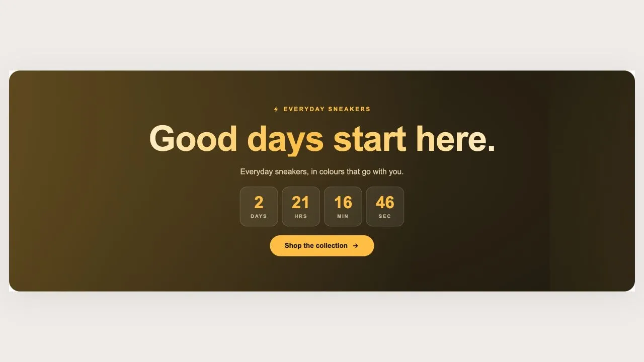
A holographic banner for a launch or a restock, running either as a countdown to a scheduled drop or as a pulsing live badge for one already open. The drop name is rendered as a holographic wordmark with a plain-colour fallback, so it is never invisible on an older browser.

View section →
Preview of the Countdown Sale 5 Shopify section Free

Countdown Sale 5

Countdown Timers

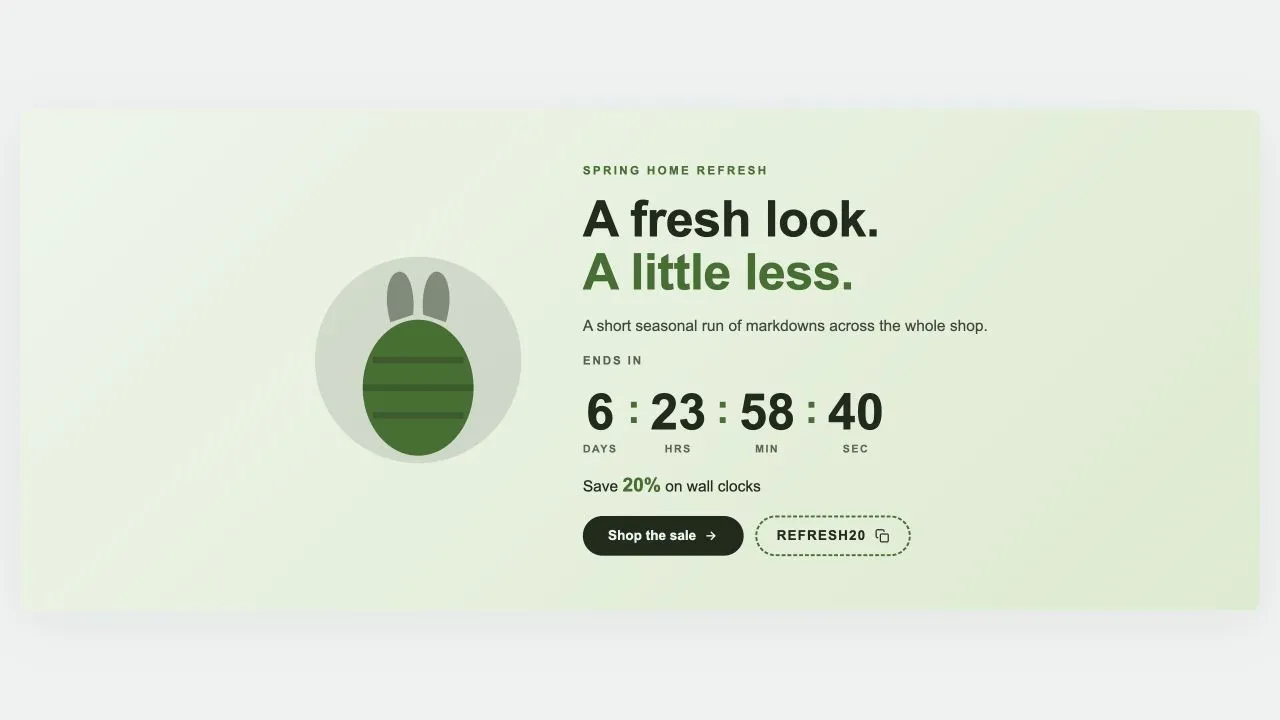
A seasonal sale band with an illustration beside the wording: pick Easter, Mother's Day, Summer, Launch day or Lunar New Year and the artwork changes while everything else stays put. Every season is drawn inline in the band's own two colours, so switching costs no extra request and can never clash. Ships with five ready-made presets.

View section →
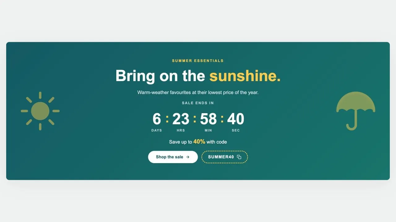
Preview of the Countdown Sale 4 Shopify section Free

Countdown Sale 4

Countdown Timers

A seasonal sale band flanked by two large emblems, from a sun and a parasol to a pumpkin and a bat. The emblems are inline SVG in the band's own highlight colour, fade back on tablets, and step aside entirely on phones where the wording needs the room.

View section →

Comparison Tables

Us-vs-them tables, pricing grids and before/after layouts that answer objections and justify the purchase.

All 9 →
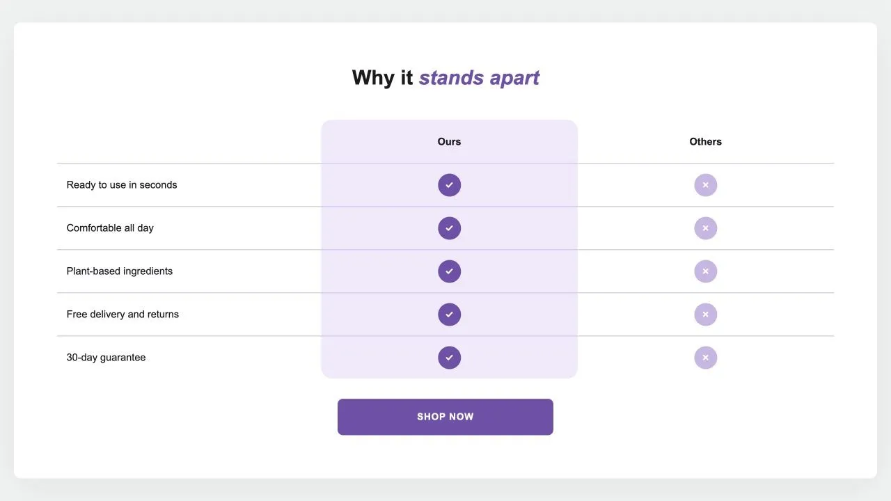
Preview of the Comparison Table 1 Shopify section Free

Comparison Table 1

24 installs

Comparison Tables

Your product against the alternatives in a real table: a tinted or framed column with a tick on every row, crosses or words for the others, an optional third column and a button underneath. {title} in the words becomes the product's title.

View section →
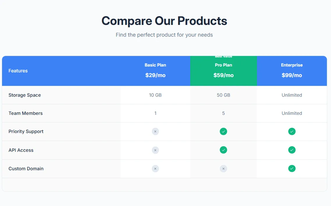
Preview of the Product Comparison Table Shopify section Free

Product Comparison Table

17 installs

Comparison Tables

Compare multiple products side by side with features table. Product images, prices, feature rows with check/X icons, highlighted recommended product, and mobile-responsive with sticky first column.

View section →
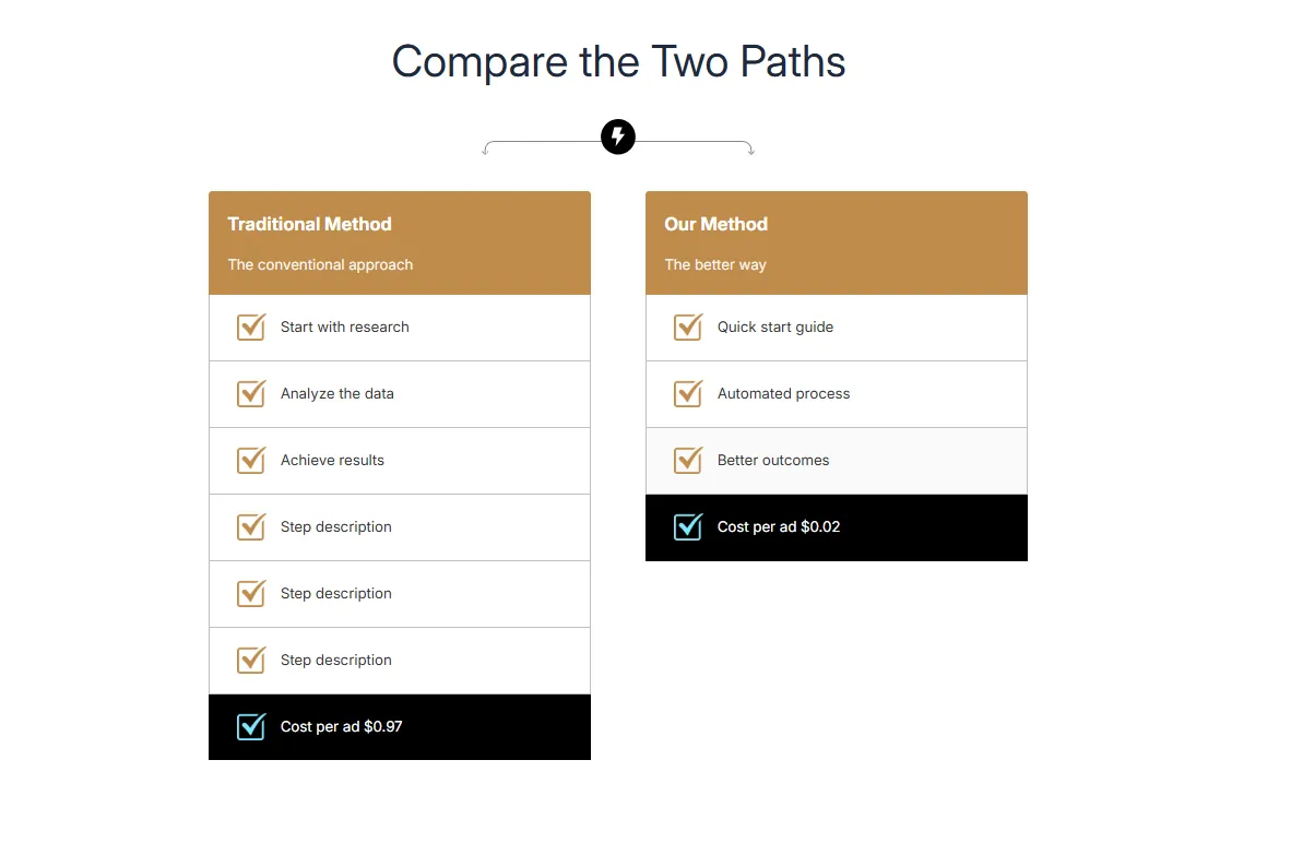
Preview of the Dual Flow Comparison Shopify section Free

Dual Flow Comparison

Comparison Tables

Compare two processes or paths side by side with step-by-step flow. Headers with images, numbered steps, and highlighted final result. Perfect for Old Way vs New Way comparisons.

View section →

FAQ Sections

Accordions, tabs, searchable lists and two-column layouts that kill pre-purchase doubts and cut support tickets.

All 7 →
Preview of the FAQ Split 1 Shopify section Free

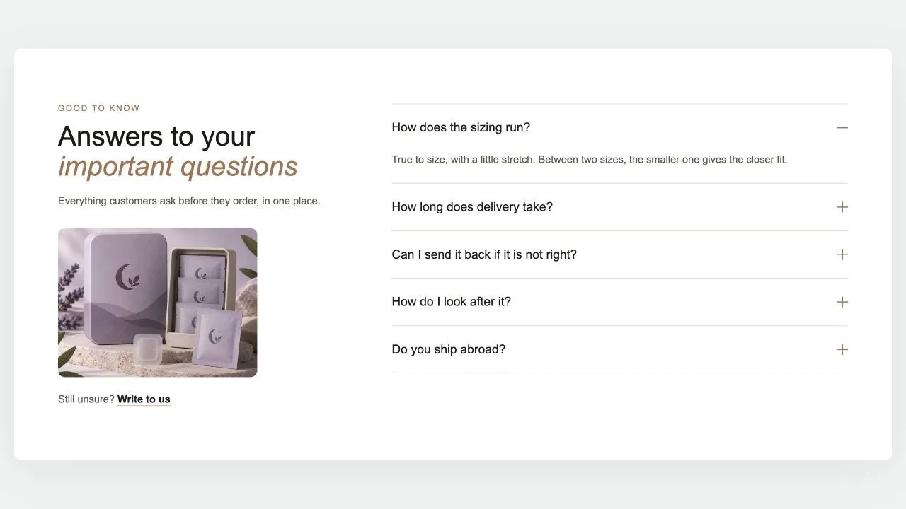
FAQ Split 1

FAQ Sections

The heading, a word of reassurance, an optional photo and a contact link on one side; the questions on the other, opening one at a time with no script. The side column stays in view while the answers scroll, and every question is published as FAQ structured data for search engines.

View section →
Preview of the Media Tabs Shopify section Free

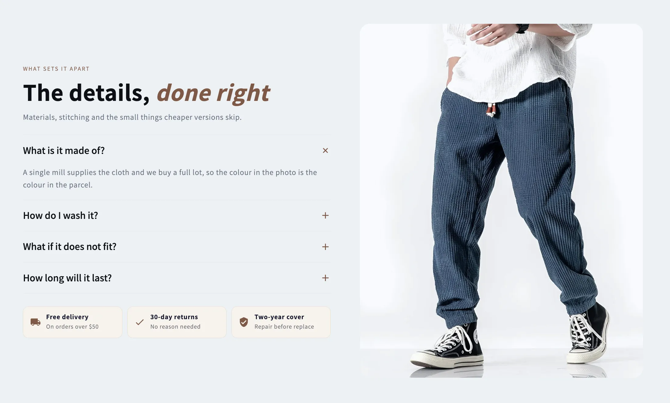
Media Tabs

FAQ Sections

A picture beside an accordion of answers, with optional chips underneath for the offers that close a sale. Takes a separate mobile crop and a link on the image.

View section →
Preview of the FAQ Searchable Shopify section Free

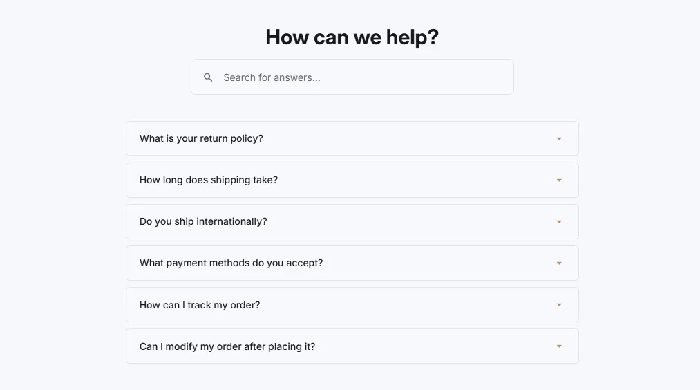
FAQ Searchable

23 installs

FAQ Sections

FAQ with search functionality and instant filtering. Search box with icon, real-time filtering as user types, highlight matching questions, and no results message.

View section →

Feature Highlights

Icon grids, cards and numbered steps that turn product benefits into scannable, convincing layouts.

All 6 →
Preview of the Results Timeline 1 Shopify section Free

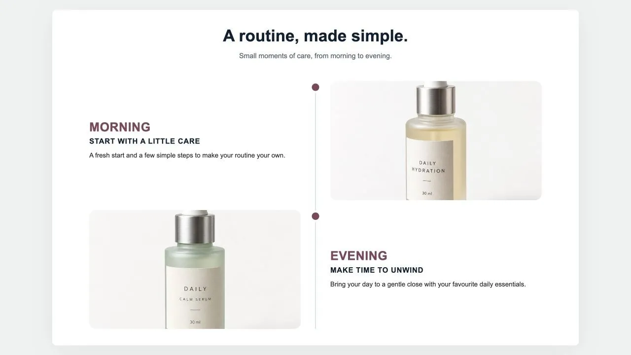
Results Timeline 1

Feature Highlights

Milestones down a centre line: a big time label, a title, a few lines, a customer quote in a card and a photo on the other side, alternating. For "what to expect and when" on a product page.

View section →
Preview of the Benefits Panel 1 Shopify section Free

Benefits Panel 1

Feature Highlights

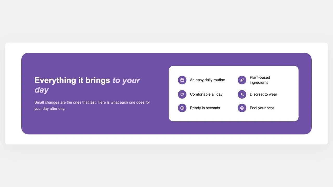
A rounded panel in your brand colour: the argument and a button on one side, and on a white card every benefit as an icon and a short label, reading down one or two columns.

View section →
Preview of the Benefit Cards 1 Shopify section Free

Benefit Cards 1

Feature Highlights

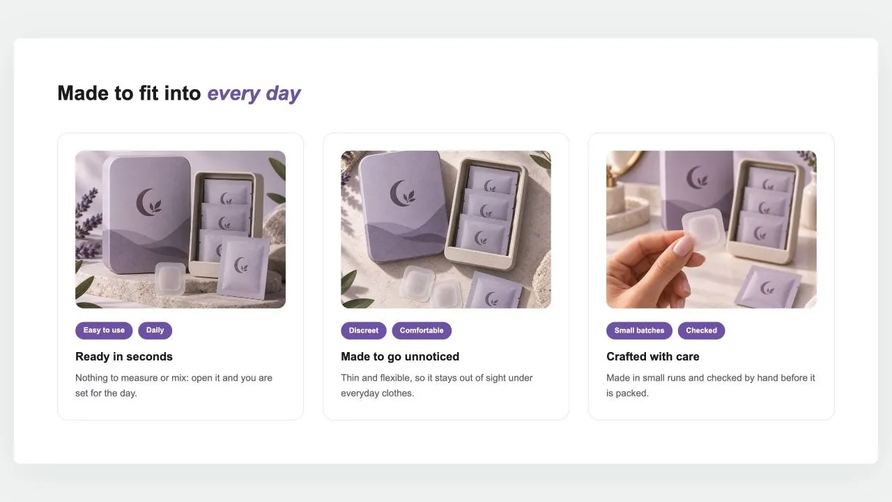
A heading over cards that each make one case: a photo set in from the card's edge, two short tags, a title and a sentence. Side by side on computers; a swipe row or a stack on phones.

View section →

Product Showcases

Galleries, spec tables, bundles and ingredient breakdowns that give product pages the detail buyers look for.

All 32 →
Preview of the Product Callouts 1 Shopify section Free

Product Callouts 1

Product Showcases

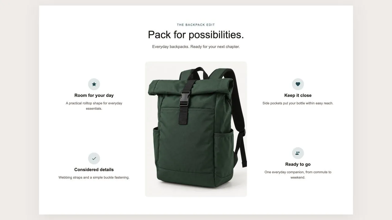
One photo in the middle and the reasons to buy set around it, half on each side, each with an icon from the shared set or your own, a title and a line of text. On a product page the photo can be the product's own until you pick another, and on phones the callouts fall into a tidy grid under the picture.

View section →
Preview of the Product Tiles 1 Shopify section Free

Product Tiles 1

Product Showcases

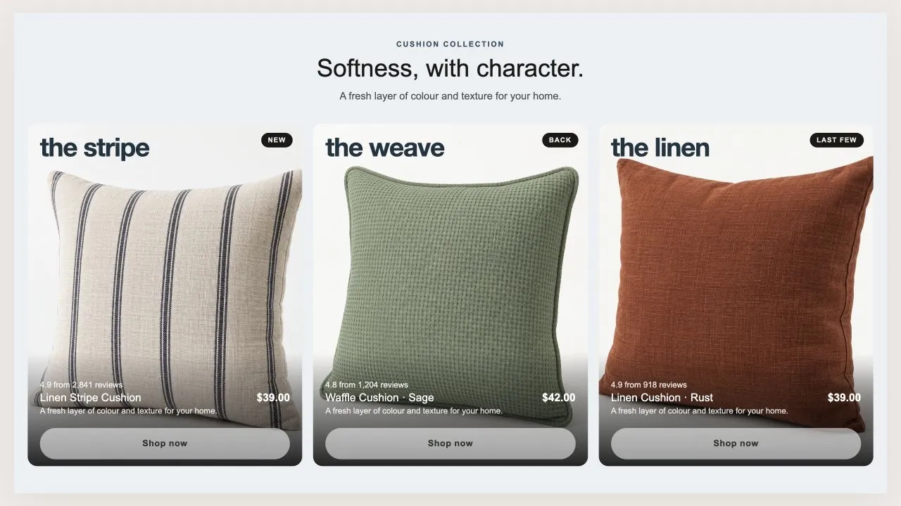
Three tall tiles, each carrying one product under a big display word. The photo flips on hover when a second one is set, and the caption trades places with the buy button. On a phone the caption can sit on the photo or under it, and the text is contrast-checked for whichever you choose.

View section →
Preview of the Product Banner 2 Shopify section Free

Product Banner 2

Product Showcases

The restrained treatment of the same shape: a light banner, one button per card, no glow, and the arrows on the banner itself rather than in a strip under the row. A lit seam is drawn where the cards meet the banner, so the overlap reads as placed rather than cropped.

View section →

Testimonials & Reviews

Carousels, walls, marquees and video testimonials — social proof formats for every store style.

All 9 →
Preview of the Review Cards 1 Shopify section Free

Review Cards 1

15 installs

Testimonials & Reviews

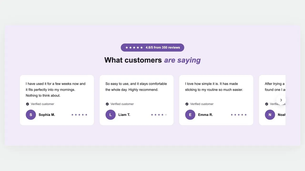
Customer reviews on a coloured band: a star rating in a pill, a heading and a row of cards that scrolls, each with the review, a verified mark, an initial or photo, the name and stars. Arrows on computers, a swipe on phones, and wavy edges if you want them.

View section →
Preview of the Reviews Summary 1 Shopify section Free

Reviews Summary 1

Testimonials & Reviews

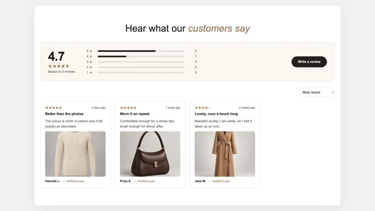
A reviews page in one section: the average and how many reviews it rests on, a bar for each star, a button to write one, then the reviews in a masonry wall with a sort menu and a Load more button. The summary is worked out from the reviews added here, or typed in when the real numbers live in another app.

View section →
Preview of the Photo Reviews 1 Shopify section Free

Photo Reviews 1

Testimonials & Reviews

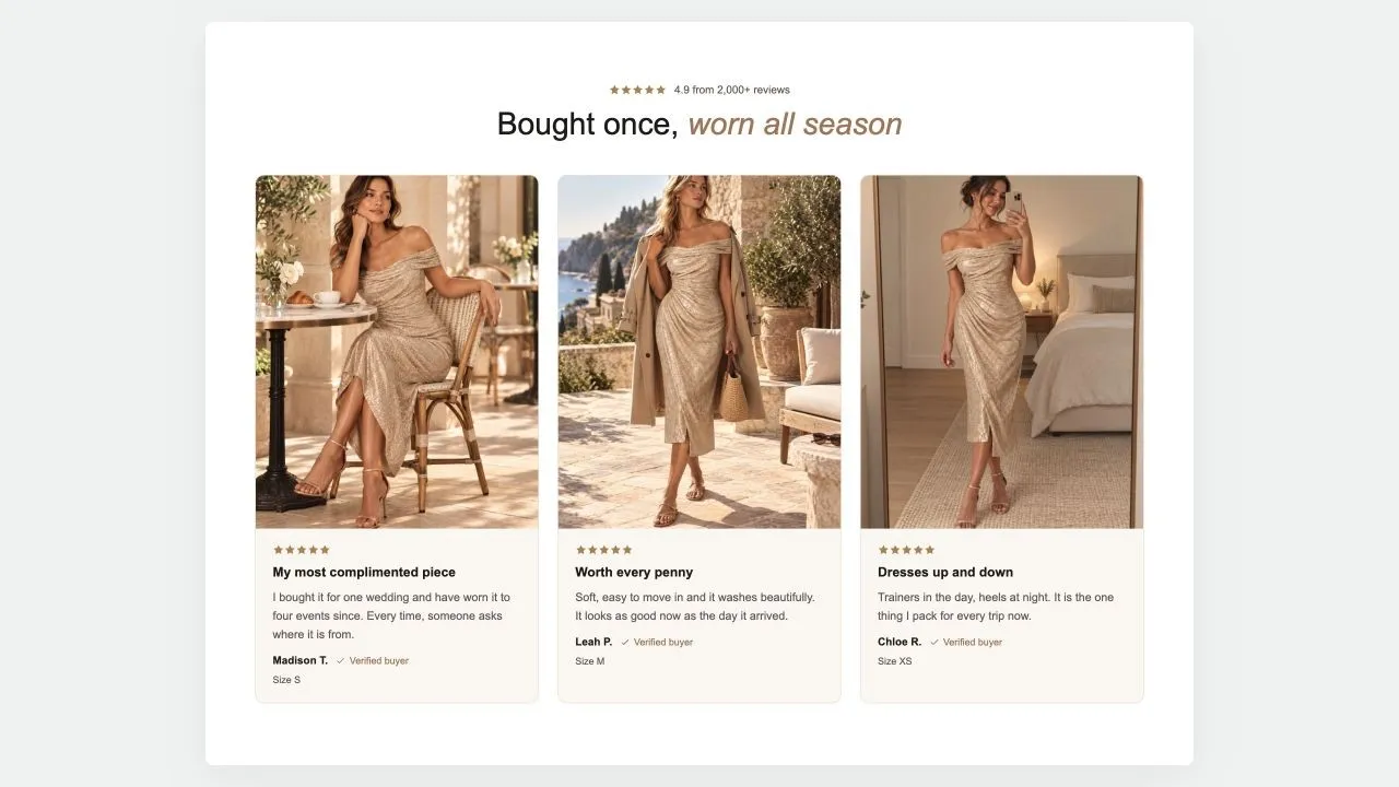
Customer reviews that lead with the photo: the piece being worn, then the stars, a title, the words and who wrote them with a verified mark. A rating line sits over the heading, the cards form a grid of two to four, and on phones they become a swipe row.

View section →

Content & Extras

Instagram feeds, blog highlights, galleries and handy utilities that round out your storefront.

All 8 →
Preview of the Team Grid 1 Shopify section Free

Team Grid 1

Content & Extras

The people behind the shop: a heading, a few lines that turn "we" into faces, then the team in a grid with a round photo, a first name, a role and one line each. Three or four per row, the last row centred.

View section →
Preview of the Blog Posts 1 Shopify section Free

Blog Posts 1

Content & Extras

The latest posts of a blog as cards: photo, date, title, an excerpt and a read-more link, two to four per row. On an article page it leaves the current post out, so it reads as "read next".

View section →
Preview of the Image Collage Shopify section Free

Image Collage

16 installs

Content & Extras

Copy and a checklist beside a grid of photos that rearranges itself around how many there are, from one to a full gallery. Every photo takes its own caption and link.

View section →

Your next storefront starts here

Explore 164 sections, complete page templates and shopping tools. Install Section Shop free and build on your existing theme.

Built for Shopify · Free to install · For Online Store 2.0 themes · No code