Section Shop

Shopify Product Showcase Sections

Galleries, spec tables, bundles and ingredient breakdowns that give product pages the detail buyers look for.

Preview of the Product Callouts 1 Shopify section Free

Product Callouts 1

Product Showcases

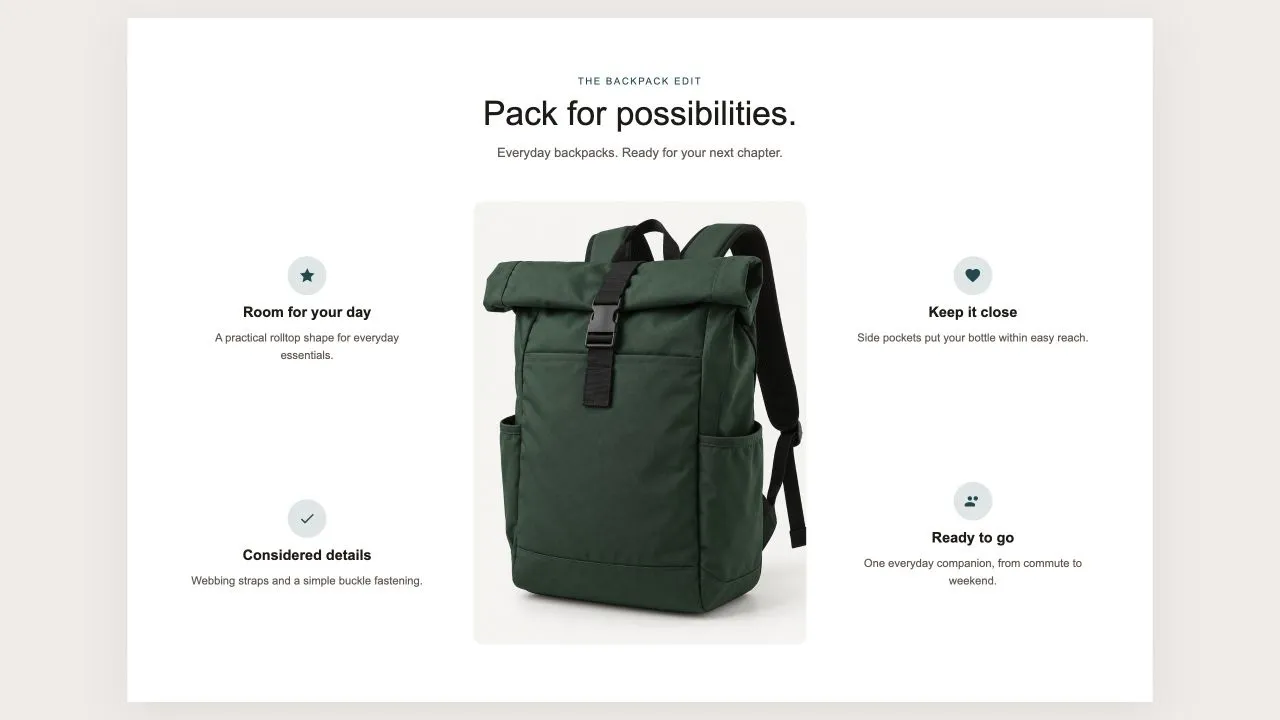
One photo in the middle and the reasons to buy set around it, half on each side, each with an icon from the shared set or your own, a title and a line of text. On a product page the photo can be the product's own until you pick another, and on phones the callouts fall into a tidy grid under the picture.

View section →
Preview of the Product Tiles 1 Shopify section Free

Product Tiles 1

Product Showcases

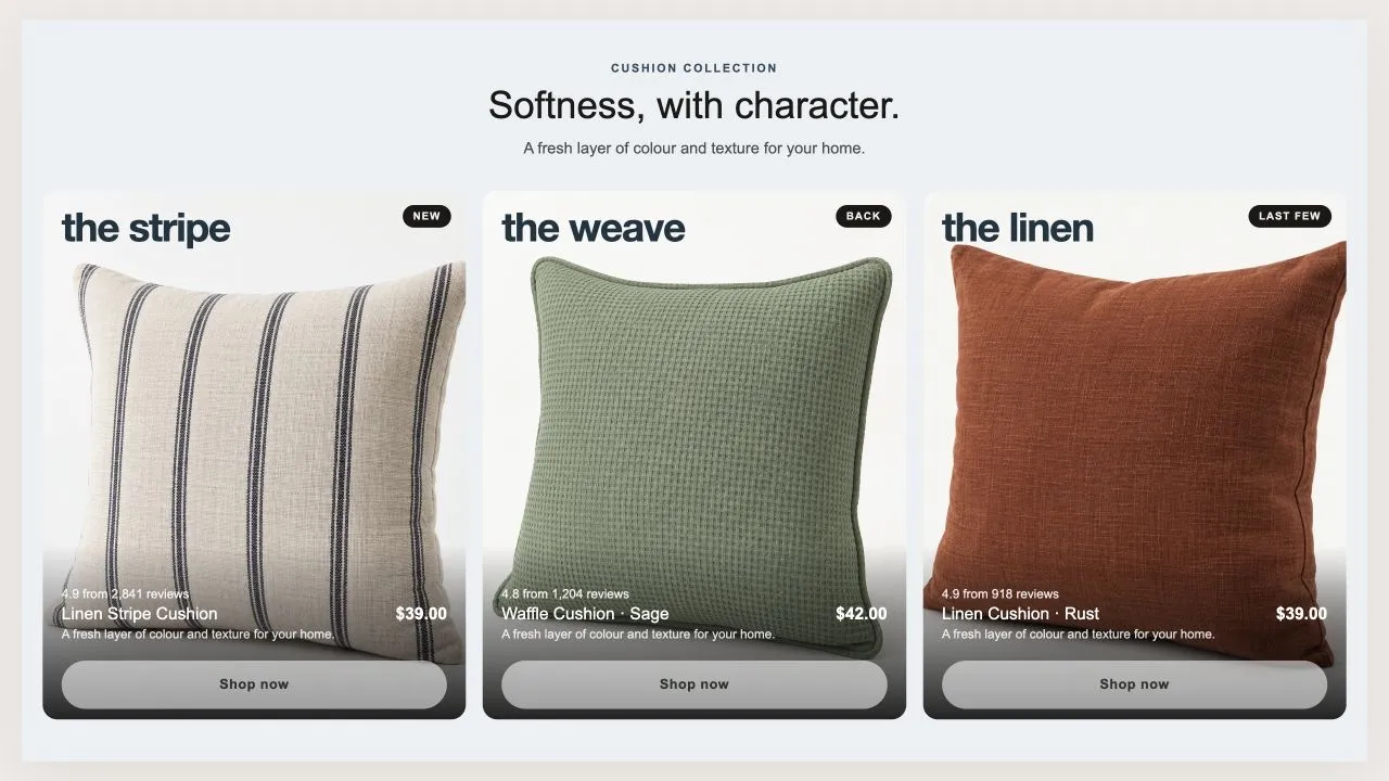
Three tall tiles, each carrying one product under a big display word. The photo flips on hover when a second one is set, and the caption trades places with the buy button. On a phone the caption can sit on the photo or under it, and the text is contrast-checked for whichever you choose.

View section →
Preview of the Product Banner 2 Shopify section Free

Product Banner 2

Product Showcases

The restrained treatment of the same shape: a light banner, one button per card, no glow, and the arrows on the banner itself rather than in a strip under the row. A lit seam is drawn where the cards meet the banner, so the overlap reads as placed rather than cropped.

View section →
Preview of the Product Banner 1 Shopify section Free

Product Banner 1

Product Showcases

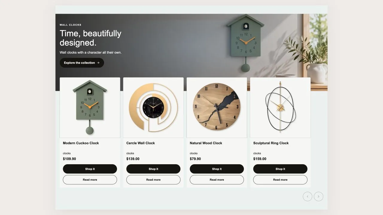
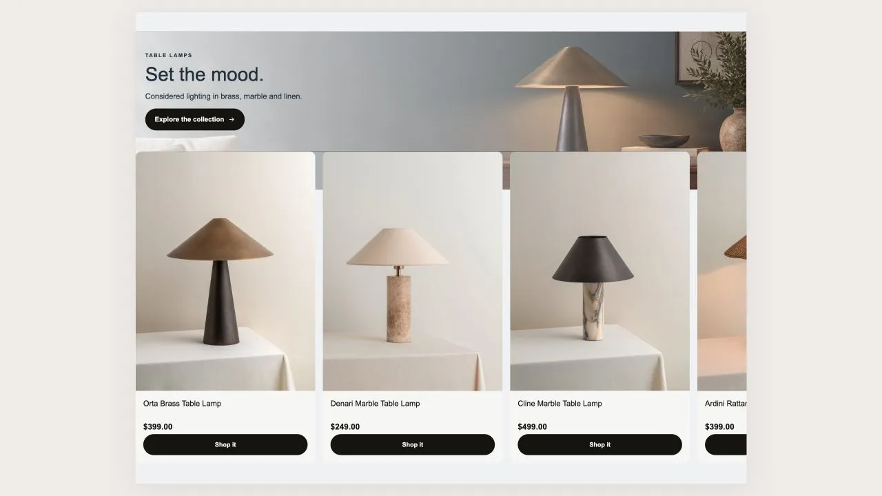
A wide banner with the message on it and the product cards tucked up over its bottom edge, so the two read as one object rather than two stacked blocks. Two buttons per card — one to buy, one to read more — and a coloured glow behind the banner photo.

View section →
Preview of the Product Slider 11 Shopify section Free

Product Slider 11

Product Showcases

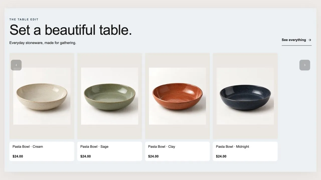
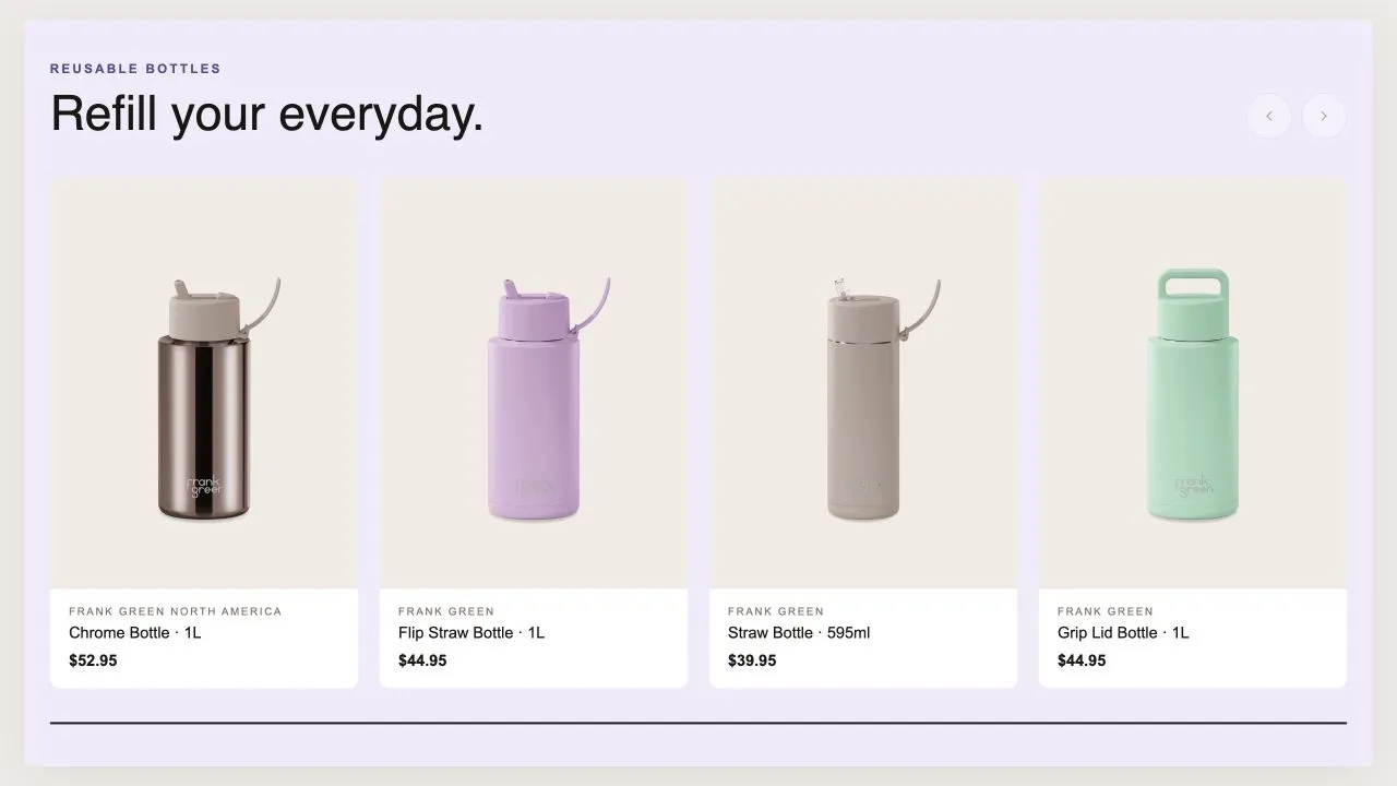
A big heading over a band of tall product tiles, each with a small info plate under the photo. Badges are read from real data — sold out, then a genuine reduction, then how recently the product was added. The arrows sit over the row or up in the heading, and can be shown on a computer without appearing on a phone.

View section →
Preview of the Product Slider 10 Shopify section Free

Product Slider 10

Product Showcases

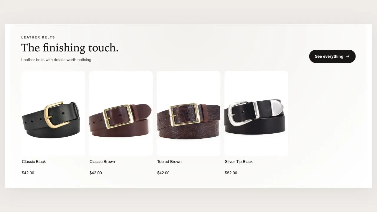
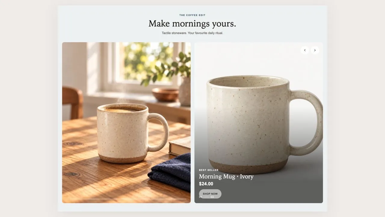
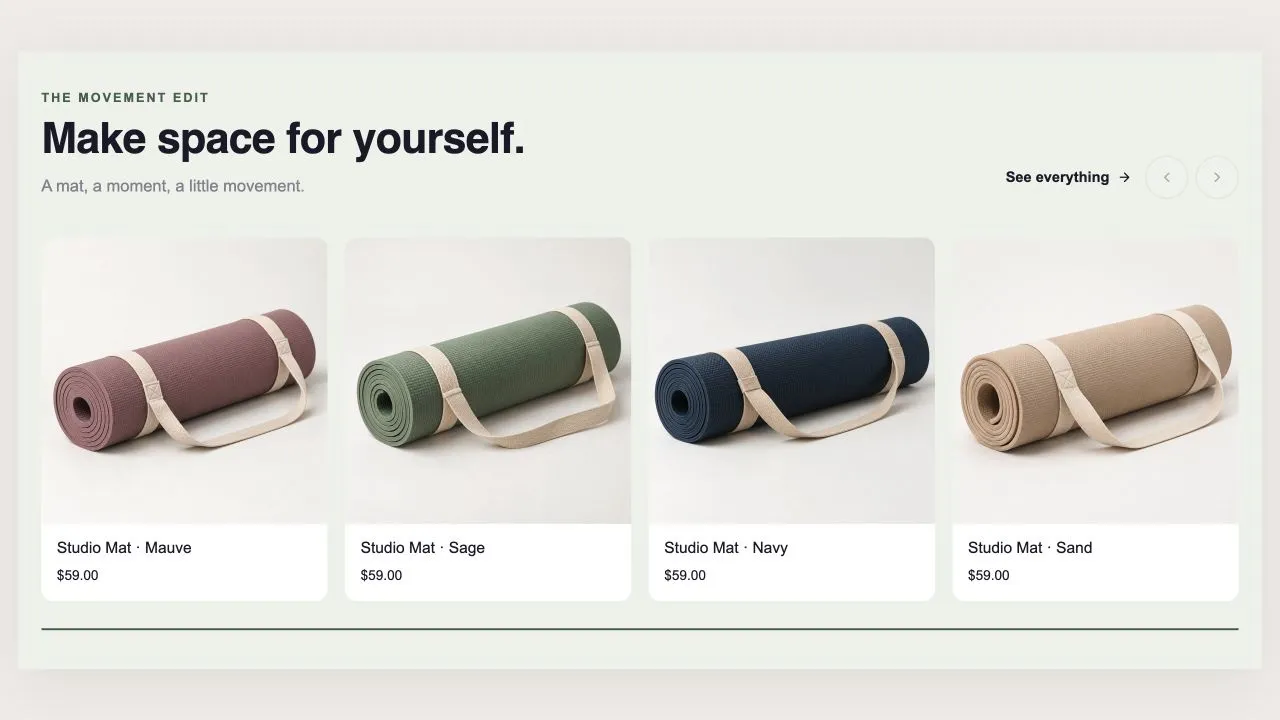
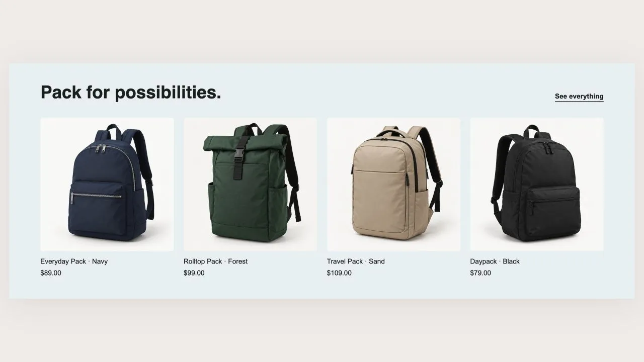
A quiet row of products under a heading and one button, with a progress line and a counter underneath. The arrows and the progress only appear when there is genuinely more to see, and the counter reads the real scroll position so it follows a swipe as well as the arrows.

View section →
Preview of the Product Slider 9 Shopify section Free

Product Slider 9

Product Showcases

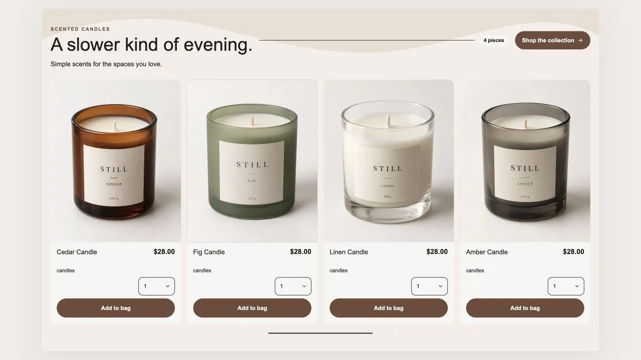
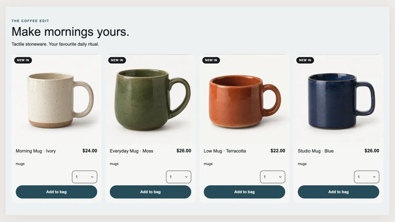
A swipe row where every card carries a size menu and a quantity menu, so a shopper can buy three of something in one go. Badges come from your own product tags, never from stock levels, and the photo follows whichever size is picked.

View section →
Preview of the Product Slider 8 Shopify section Free

Product Slider 8

Product Showcases

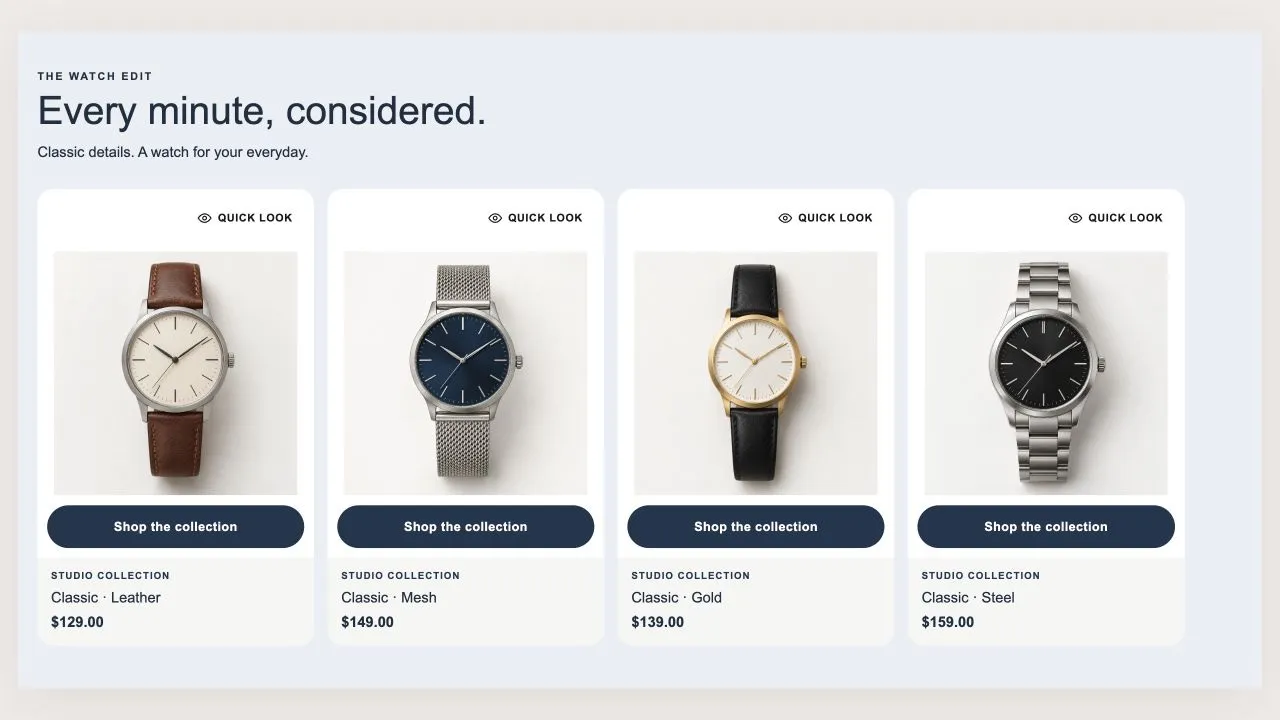
A swipe row of framed product cards. A size row opens on the photo so a shopper can add without leaving the page, and the eye button opens a quick look with the options, a quantity and the buy buttons. Both ship as plain links and are upgraded by script, so nothing on the card is ever a control that does nothing.

View section →
Preview of the Product Slider 7 Shopify section Free

Product Slider 7

Product Showcases

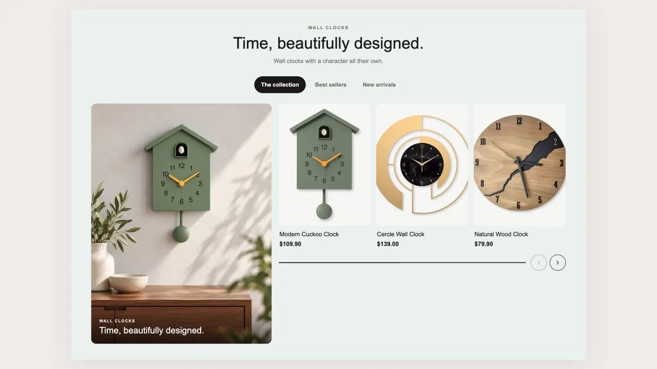
A large lifestyle tile on the left and a swipe row of products on the right, with tabs across the top so one section covers new in, dresses and knitwear. Size buttons on the card update the price and link straight to that size.

View section →
Preview of the Product Grid 6 Shopify section Free

Product Grid 6

Product Showcases

A shelf that can be a grid or a swipe row, with optional tabs across the top. Every card carries a size menu and a quantity menu, so a shopper can buy two of something without adding it twice. Card height is decided once for the whole section, so switching tabs never makes the shelf jump.

View section →
Preview of the Product Grid 5 Shopify section Free

Product Grid 5

Product Showcases

A compact buy grid built for bundles and repeat purchases: small photo, name, price and the buttons right there. On a phone the card turns sideways so more fits on screen. A product with more than one size links to its own page rather than guessing.

View section →
Preview of the Product Grid 4 Shopify section Free

Product Grid 4

Product Showcases

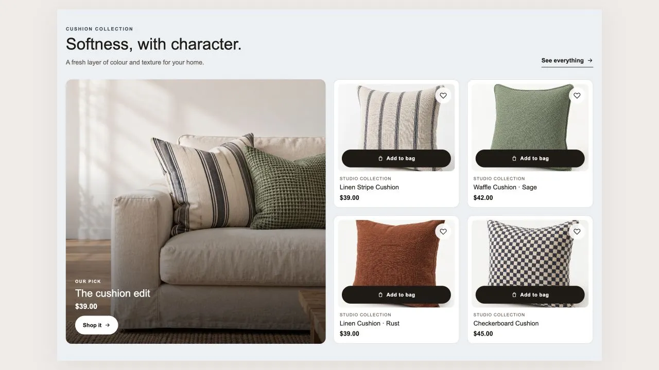
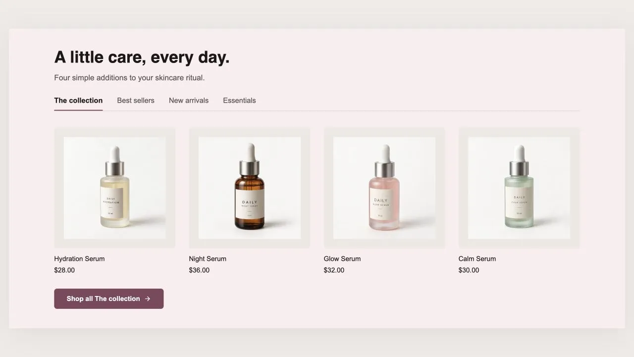
A grid with an optional large lead tile beside it, and a line under the price that adapts to what you sell: colour dots and a size range for clothing, or spec chips read from tags. Saved items live in the shopper's own browser, so no account is needed.

View section →
Preview of the Product Story 1 Shopify section Free

Product Story 1

Product Showcases

One product per slide, told as an editorial spread: the lifestyle photo on the left, a card on the right carrying the packshot, the name, the price and the button. Swipes natively, with a progress line and a slide counter. No slider library and no webfont — every type option uses a face already on the shopper's device.

View section →
Preview of the Product Slider 6 Shopify section Free

Product Slider 6

Product Showcases

The workhorse: one collection, a swipe row of product cards with badges read from real data, an optional saved-items heart, quick add, star ratings and colour dots. Flip one switch and the row becomes a stacked grid instead.

View section →
Preview of the Product Slider 5 Shopify section Free

Product Slider 5

Product Showcases

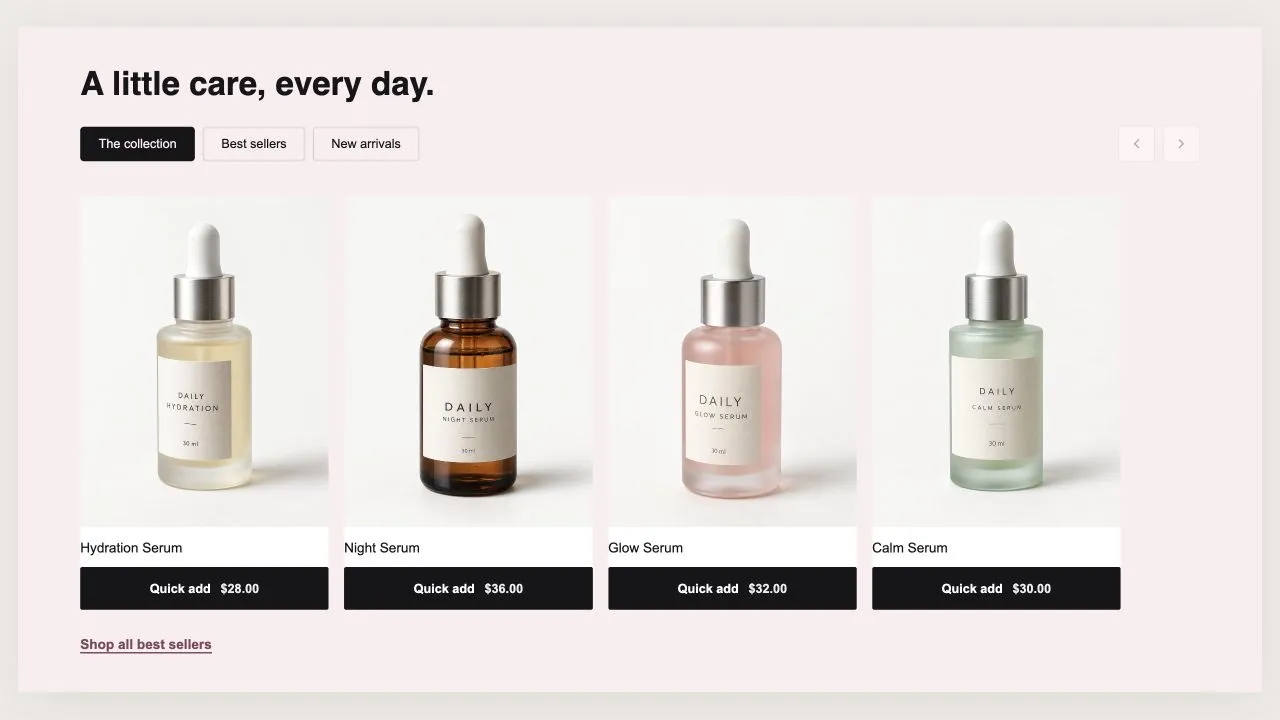
Tabs over a swipe row where the size picker lives on the card itself, so a shopper can add without leaving the page. The photo and the price both follow the size that is picked, and the photo map is keyed by image so a thirty-variant product does not carry thirty entries.

View section →
Preview of the Product Slider 4 Shopify section Free

Product Slider 4

Product Showcases

A rail of best sellers where the rank is earned, not decorative: the numbers only appear when the collection is genuinely sorted by best selling, and the theme editor tells you when it is not. Star ratings come from whatever review app you already run.

View section →
Preview of the Product Slider 3 Shopify section Free

Product Slider 3

Product Showcases

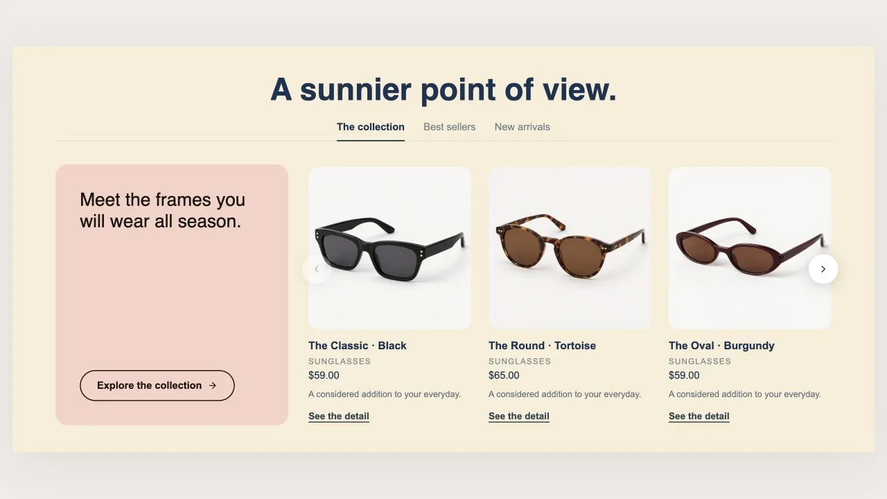
Tabs under a centred heading, and inside each tab a coloured promo card sitting beside the products. Each tab gets its own message, its own colour and its own button, and the text on the card is coloured for contrast automatically.

View section →
Preview of the Product Slider 2 Shopify section Free

Product Slider 2

Product Showcases

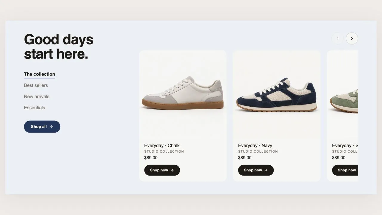
A column on the left holding the heading, the tabs and one button that follows whichever tab is open; the products swipe past on the right. The low-stock badge reads real inventory, so it can never invent scarcity.

View section →
Preview of the Product Slider 1 Shopify section Free

Product Slider 1

Product Showcases

A swipeable rail of product cards with a quick-look panel carrying the photo, price, description, quantity and buy-now. Pulls a collection, or hand-picked products when no collection is set. No slider library — the rail is native scroll-snap.

View section →
Preview of the Product Grid 3 Shopify section Free

Product Grid 3

Product Showcases

Tabs with an underline that travels, one product grid under each and a button per tab. A tab takes a collection or a hand-picked list. On phones the grid becomes a swipe row so a peek of the next product invites the scroll.

View section →
Preview of the Product Grid 2 Shopify section Free

Product Grid 2

Product Showcases

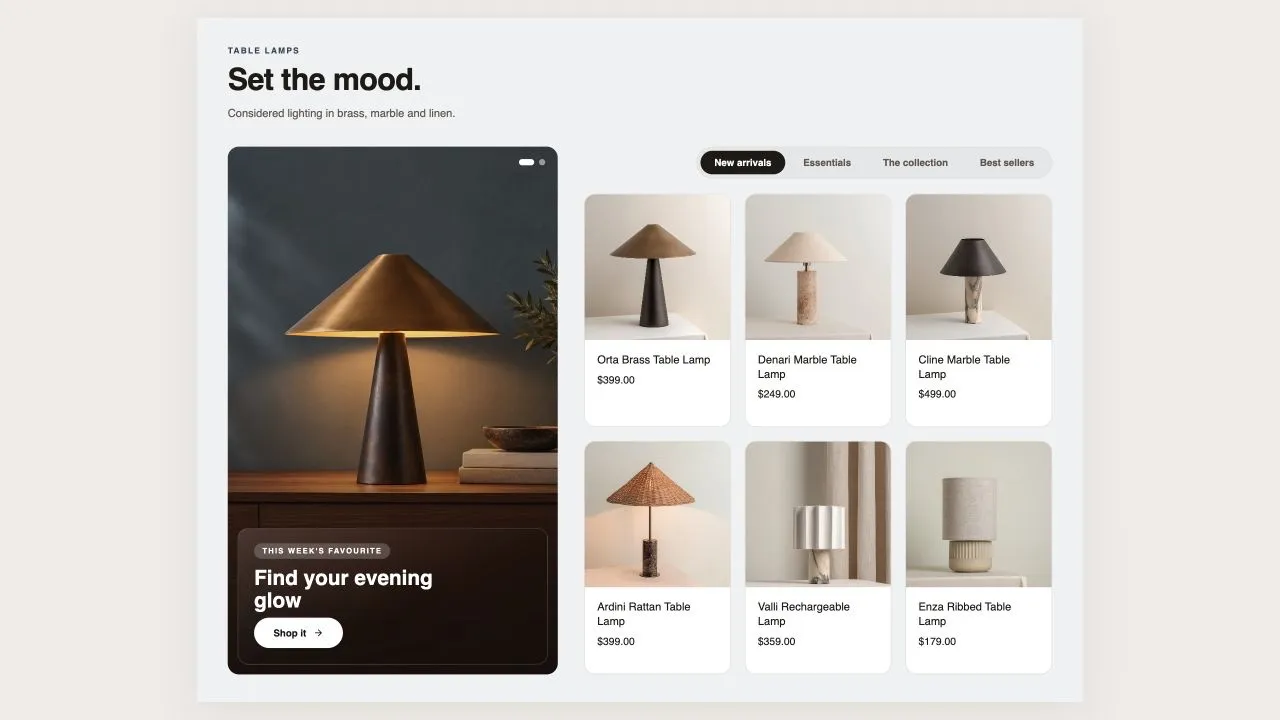
A tall rotating showcase on the left and a tabbed product grid on the right, so one section covers new in, dresses and sale without stacking three. Quick look opens a panel; single-variant products add straight to the bag.

View section →
Preview of the Product Grid 1 Shopify section Free

Product Grid 1

Product Showcases

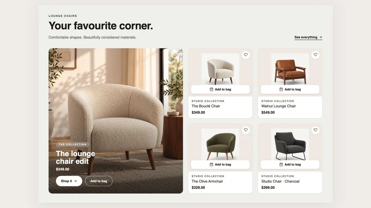
A collection grid with an optional large lead tile beside it, a saved-items heart, quick add, star ratings from your review app, automatic Sale, New and Sold-out badges, and a colour or spec row under the price. The button label is measured for contrast against whatever colour you pick.

View section →
Preview of the Shop The Look 5 Shopify section Free

Shop The Look 5

Product Showcases

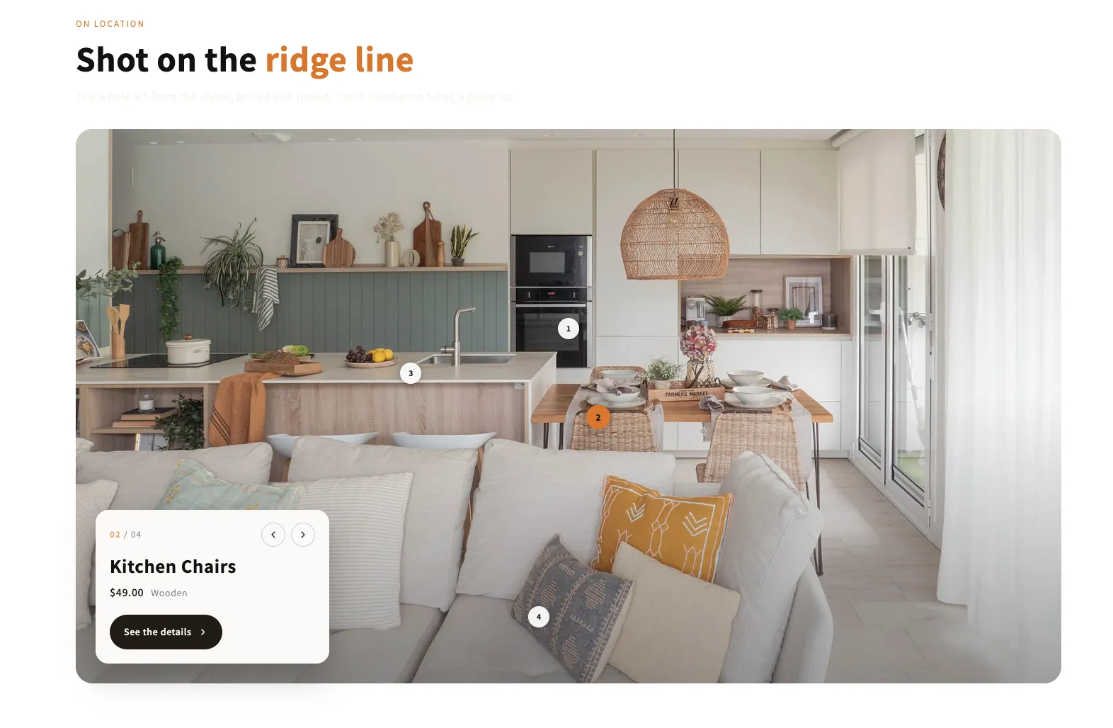
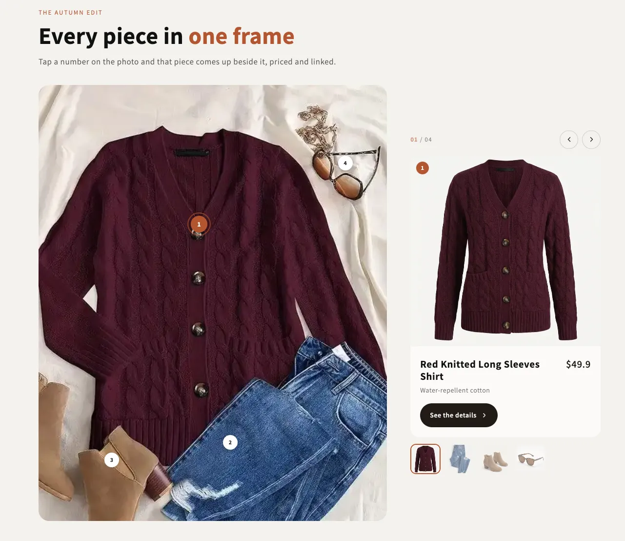
An editorial full-bleed shot with numbered pins and one card floating in a corner of it. The card follows whichever pin is open, and on phones it can drop below the photo instead of covering the look.

View section →
Preview of the Shop The Look 4 Shopify section Free

Shop The Look 4

Product Showcases

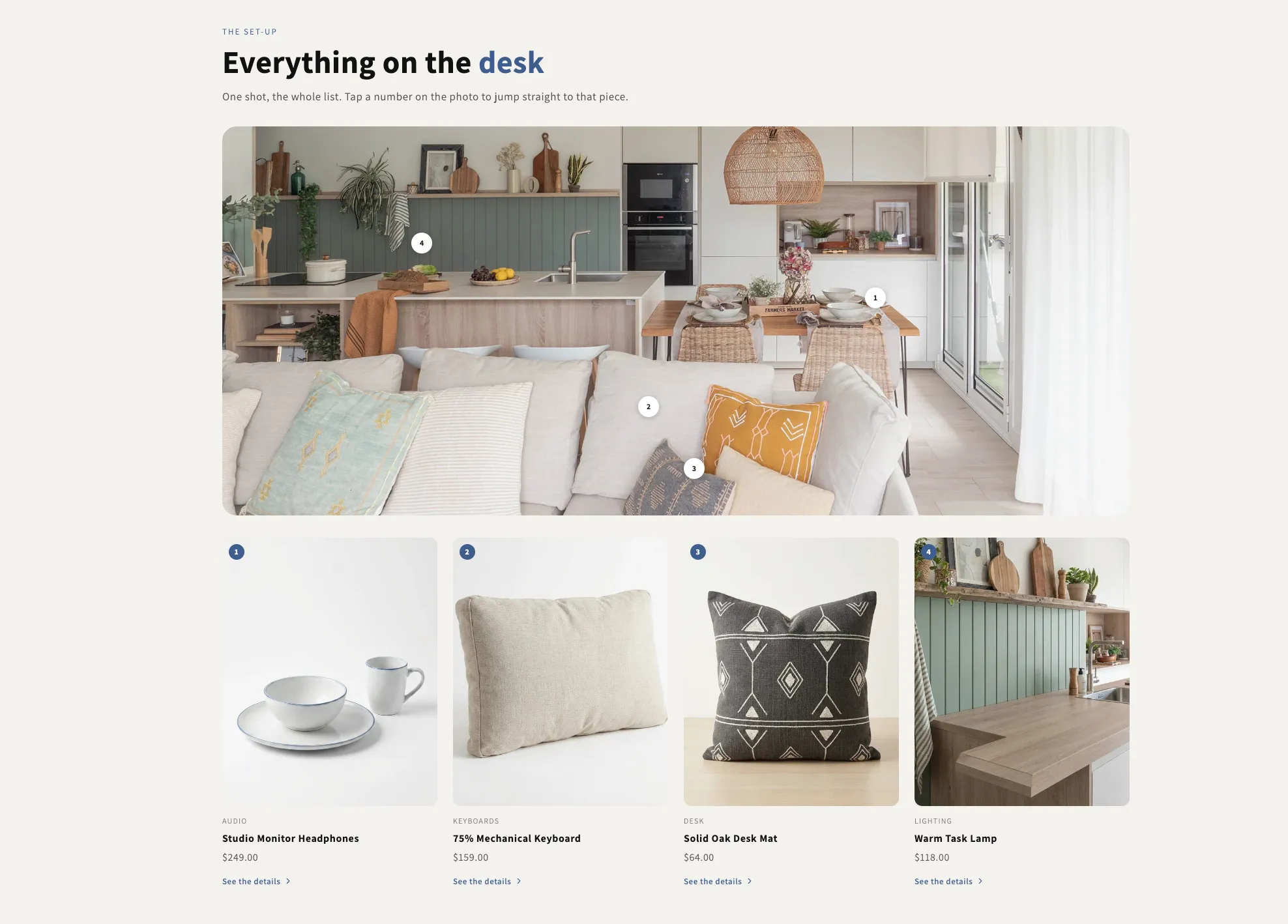
One wide shot with numbered pins and the full list laid out underneath. A pin scrolls its card into view and rings it, and hovering a card lights its pin, so the photo and the grid always read as the same list.

View section →
Preview of the Shop The Look 3 Shopify section Free

Shop The Look 3

Product Showcases

A swipeable rail of styled scenes, each with its own pins and captions. Every pin opens a small product card over the photo, and the badge counting the pieces in a scene is worked out from the pins themselves so it can never go stale.

View section →
Preview of the Shop The Look 2 Shopify section Free

Shop The Look 2

Product Showcases

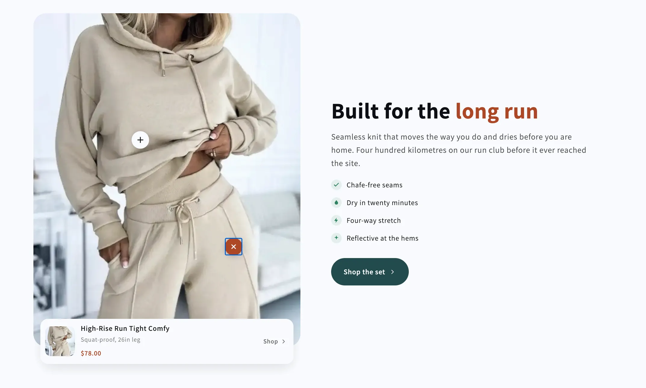
A shoppable photo on one side and the sales copy on the other. Pins open a product card docked to the bottom of the photo, while the copy column is built from heading, text, checklist and button blocks you can reorder freely.

View section →
Preview of the Shop The Look 1 Shopify section Free

Shop The Look 1

Product Showcases

A styled photo with numbered pins and a product card beside it that follows whichever pin is open. Arrows, a counter and a thumbnail row all drive the same index, so the card, the pins and the thumbs can never disagree.

View section →
Preview of the Product Ingredients Shopify section Free

Product Ingredients

38 installs

Product Showcases

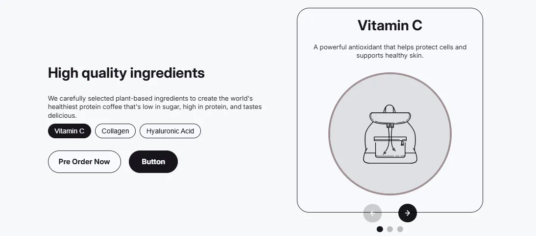
Product ingredients section with ingredient cards showing name, description, and optional image. Perfect for skincare, supplements, or food products.

View section →
Preview of the Product Bundle Shopify section Free

Product Bundle

30 installs

Product Showcases

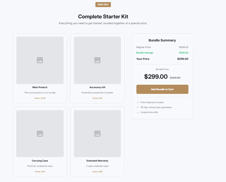
Display product bundle or kit with included items. Bundle image, list of included products, savings badge, total value display, and add bundle to cart CTA.

View section →
Preview of the Product Specifications Shopify section Free

Product Specifications

41 installs

Product Showcases

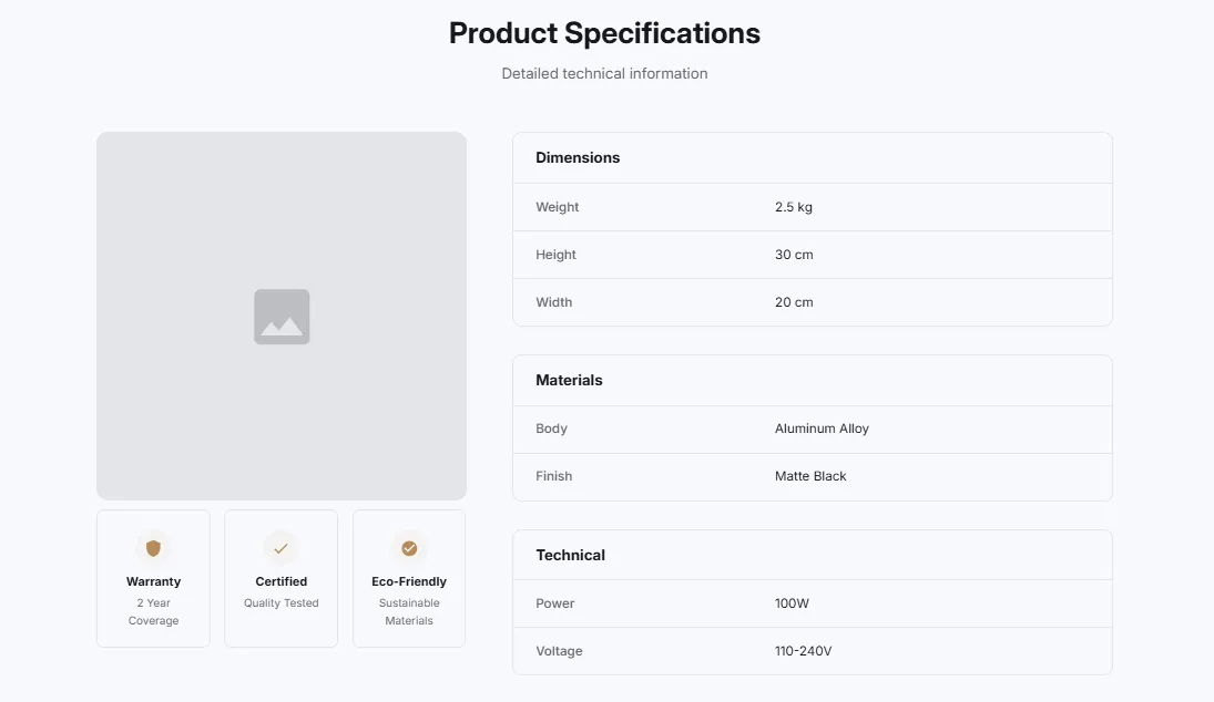
Product with detailed specifications table. Alternating row colors, specification labels and values, product image, and organized technical details.

View section →
Preview of the Product Gallery Shopify section Free

Product Gallery

65 installs

Product Showcases

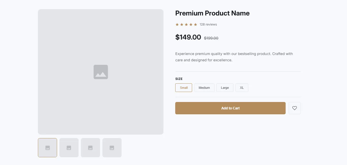
Product with image gallery and thumbnails. Main image display with thumbnail navigation, zoom on hover, and product info section with price and CTA.

View section →
Preview of the Product Features Shopify section Free

Product Features

46 installs

Product Showcases

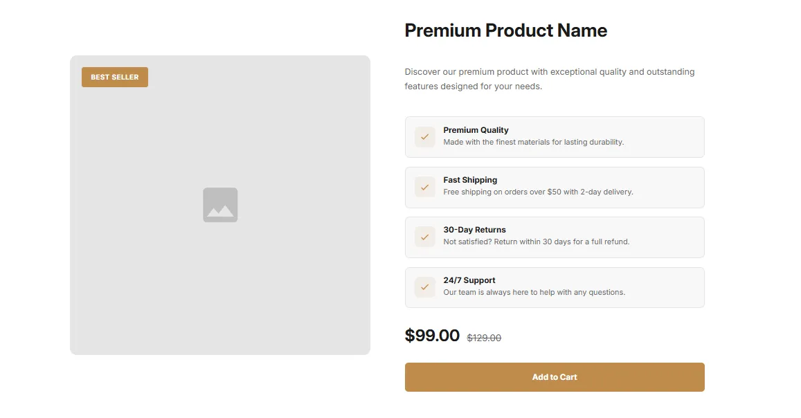
Product display with feature highlights in a two-column layout. Large product image on one side, feature list with icons on the other, and CTA button.

View section →

Other categories

Add product showcases to your store today

Explore 164 sections, complete page templates and shopping tools. Install Section Shop free and build on your existing theme.

Built for Shopify · Free to install · For Online Store 2.0 themes · No code