
Benefit Cards 1
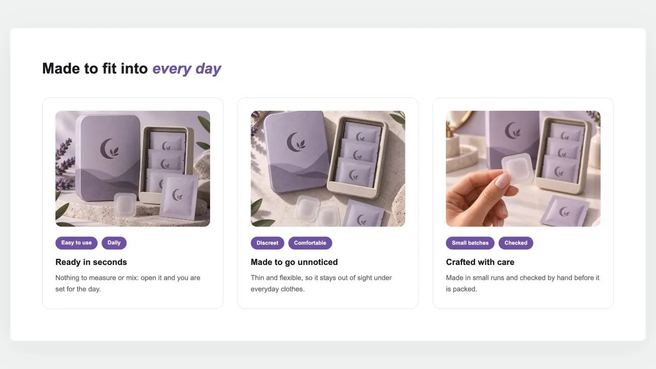
Benefit Cards 1
A heading over cards that each make one case: a photo set in from the card's edge, two short tags, a title and a sentence. Side by side on computers; a swipe row or a stack on phones.
- Price
- Free
- Category
- Feature Highlights
- Merchant installs
- 6
- Works with
- Any OS 2.0 theme
Installs via the Section Shop app · shows as “SShop:Benefit Cards 1” in your editor
- features
- benefits
- cards
- tags
- usp
- product page
How to add Benefit Cards 1 to your store
- 1
Install Section Shop
Get the free app from the Shopify App Store — takes one click.
- 2
Add “Benefit Cards 1”
Find it in the Feature Highlights category and click Add to theme.
- 3
Customize in your editor
It appears as “SShop:Benefit Cards 1” — edit text, images, colors and fonts, then save.
More feature highlights sections
View all →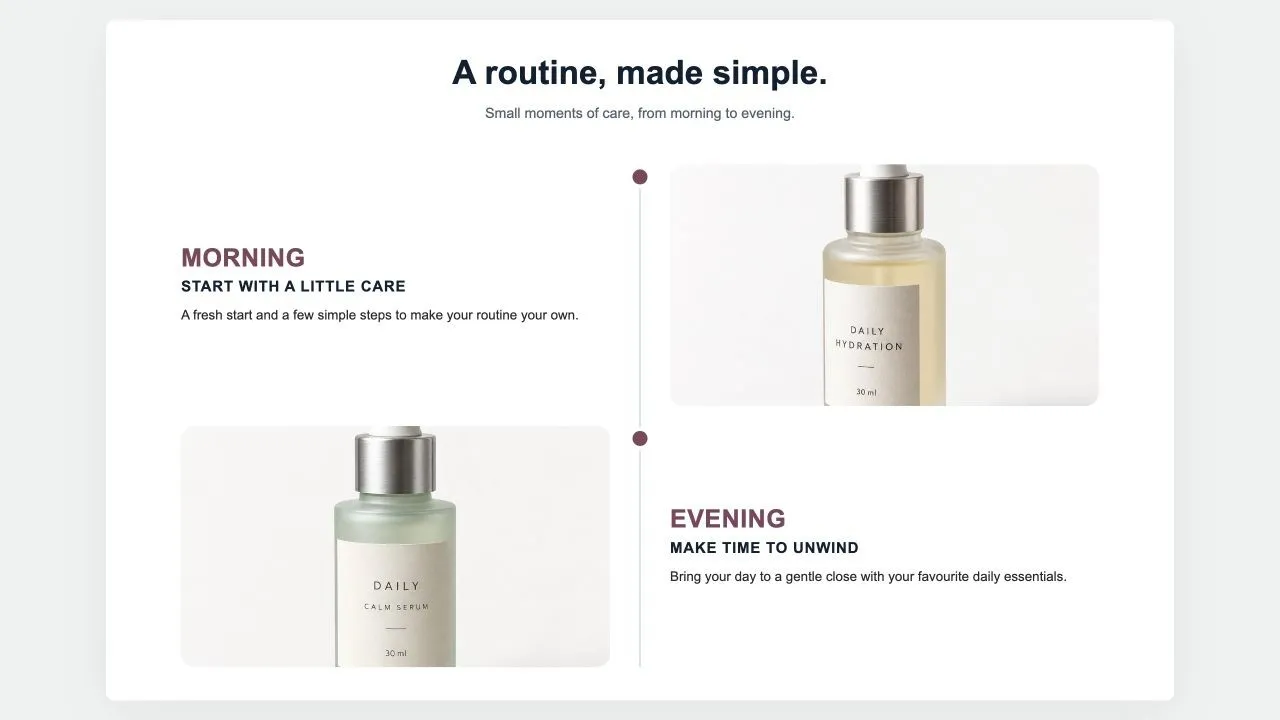 Free
Results Timeline 1
Feature Highlights
Milestones down a centre line: a big time label, a title, a few lines, a customer quote in a card and a photo on the other side, alternating. For "what to expect and when" on a product page.
View section →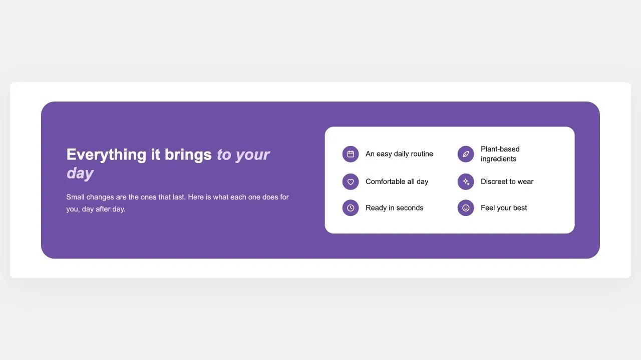 Free
Benefits Panel 1
Feature Highlights
A rounded panel in your brand colour: the argument and a button on one side, and on a white card every benefit as an icon and a short label, reading down one or two columns.
View section →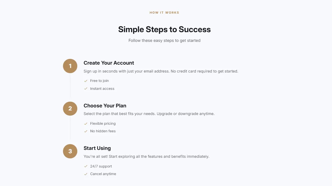 Free
Features Numbered
18 installsFeature Highlights
Numbered features/steps with descriptions in a timeline style. Circular number badges, connecting lines between steps, and optional feature bullet points per step.
View section →