
Hero Slider 1
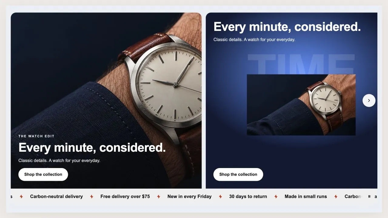
Hero Slider 1
A row of hero panels a shopper swipes through, with a band of promises welded to the bottom. Each panel is either a photograph with the words over it, or a product on a colour of your choosing under a big faded word — and a showcase panel measures its own background, so a pale panel flips the text to dark rather than losing it.
- Price
- Free
- Category
- Hero & Banners
- Merchant installs
- 4
- Works with
- Any OS 2.0 theme
Installs via the Section Shop app · shows as “SShop:Hero Slider 1” in your editor
- hero
- carousel
- rail
- swipe
- showcase
- scrolling band
How to add Hero Slider 1 to your store
- 1
Install Section Shop
Get the free app from the Shopify App Store — takes one click.
- 2
Add “Hero Slider 1”
Find it in the Hero & Banners category and click Add to theme.
- 3
Customize in your editor
It appears as “SShop:Hero Slider 1” — edit text, images, colors and fonts, then save.
More hero & banners sections
View all →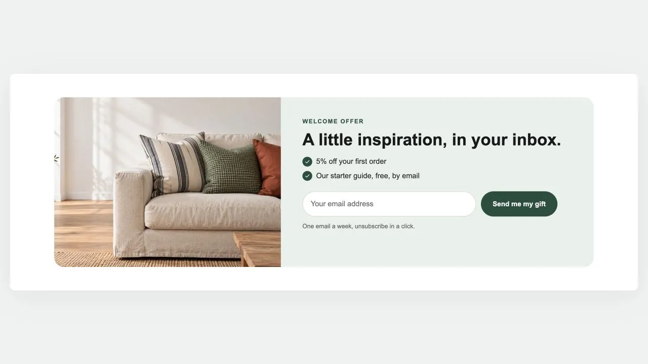 Free
Newsletter Band 1
Hero & Banners
A sign-up band with an offer: a heading, three perks with a tick, the email field and the button, a photo beside it if you like. Subscribers get the newsletter tag; the thank-you shows in place.
View section →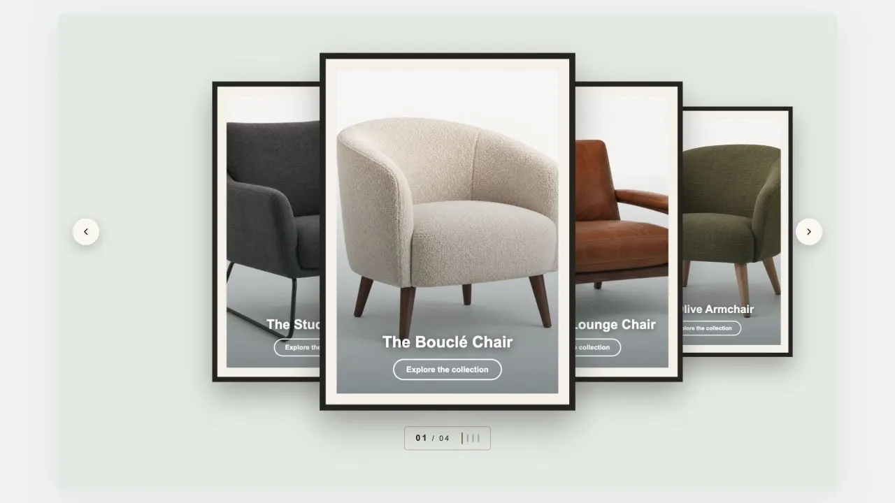 Free
Coverflow 2
Hero & Banners
A gallery wall: each photograph sits in a mat and a frame, hung in a row that recedes to either side of the one in front. Navigation is a brass plaque with the piece number and a row of tick marks, the way a wall label works. Hangs flat by default, and leans as far as you want it to.
View section →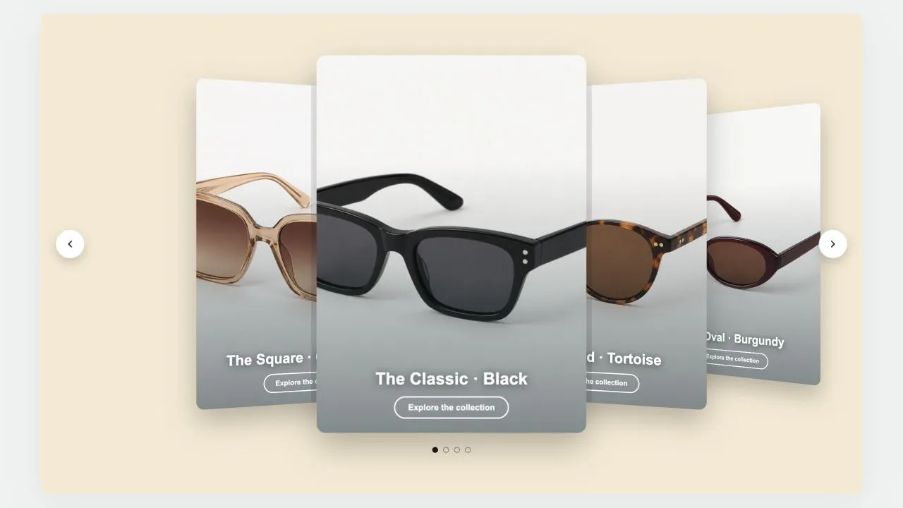 Free
Coverflow 1
Hero & Banners
A leaning deck of cards: one in front, its neighbours fanned out behind and shrinking with distance. Each card carries a signed offset from the centre as a CSS custom property and one transform rule reads it, so moving the deck rewrites numbers rather than markup. Clicking a card behind brings it forward.
View section →