
Mega Search Header
Mega Search Header
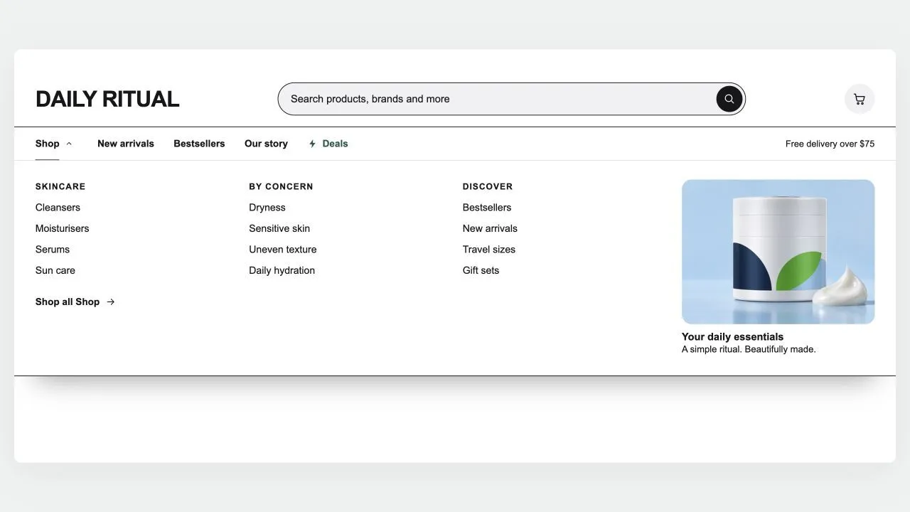
A header built around search, for large catalogues: a wide search bar with a product-type picker and live suggestions (matching searches first, then products with photo and price), and a menu row whose items open panels across the full width, as wide as the page, or as a card sized to their links — headed columns for three-level menus, each collection's picture in front of its link (square, rounded or round, as you set), a "Shop all" link, and stacked pictures or banners on either side of the links. Any menu item can wear a small label such as HOT or NEW in your colours, with a twinkling icon if you like. A deal link shines in your accent colour, and the cart can wear your own icon. Shoppers sign in through Shopify's own account button and choose their country (and so their currency) and language in a compact panel with a search box for long lists. It stays on top as the page scrolls (slimmer, hidden on the way down, or down to the menu row alone), keeps the cart count right after any add to cart, and becomes a side-sheet menu on phones with its own search row, the same pictures and labels, short texts and your own code above or below each item's links, and the first link of each sub-menu worded as you like. Every in-between tone is computed from your colours and checked for contrast.
- Price
- Free
- Category
- Headers & Navigation
- Merchant installs
- 13
- Works with
- Any OS 2.0 theme
Installs via the Section Shop app · shows as “SShop:Mega Search Header” in your editor
- header
- navigation
- mega menu
- search
- predictive search
- sticky header
How to add Mega Search Header to your store
- 1
Install Section Shop
Get the free app from the Shopify App Store — takes one click.
- 2
Add “Mega Search Header”
Find it in the Headers & Navigation category and click Add to theme.
- 3
Customize in your editor
It appears as “SShop:Mega Search Header” — edit text, images, colors and fonts, then save.
More headers & navigation sections
View all →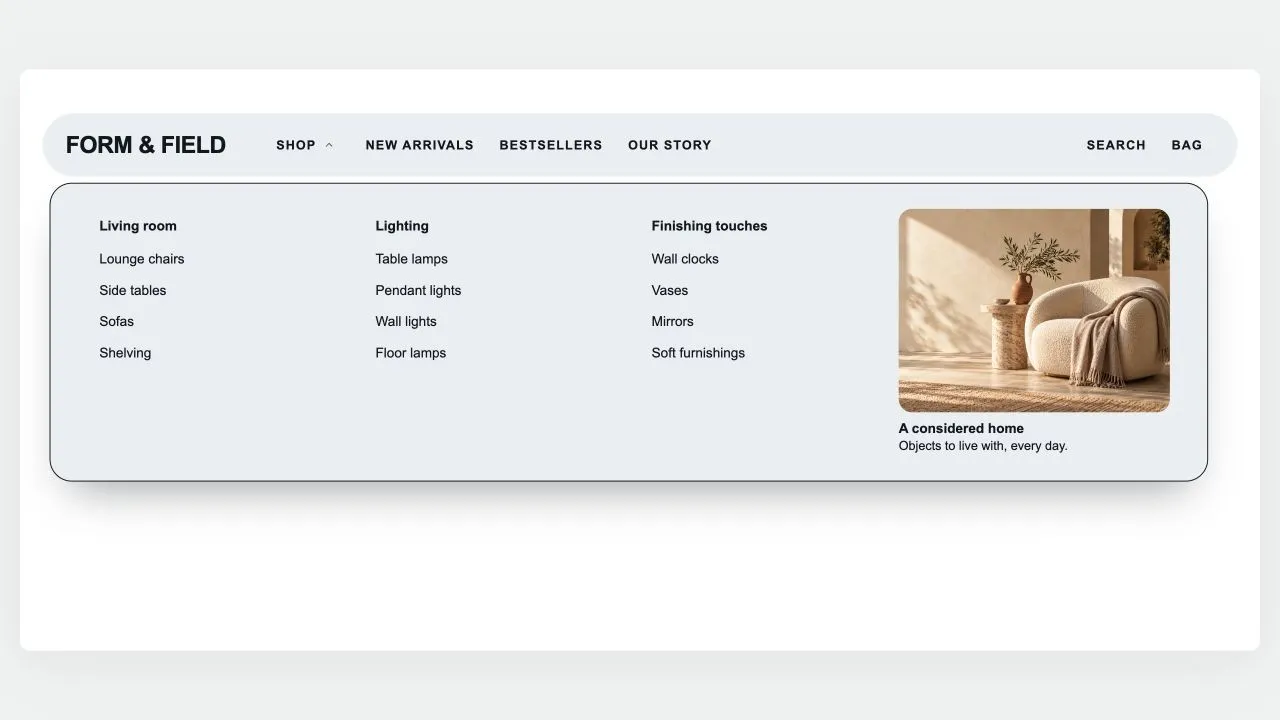 Free
Free Island Header
Headers & Navigation
A floating, rounded header that sits on the page like an island: the menu on one side, your logo in the middle (or first, with the space beside it yours to set), search, account and cart on the other. A pill glides between menu items and rests on the page being viewed; drop-downs open as a card sized to their links, as wide as the island or across the whole screen, show each collection's picture in front of its link (square, rounded or round, as you set), group three-level menus and hold stacked pictures or banners on either side of the links. Any menu item can wear a small label such as HOT or NEW in your colours, with a twinkling icon if you like: above the name on computers, beside it on phones. The phone menu can show the same pictures, opens each sub-menu on the item's name, on "All" in the shopper's language or on words of your own, and places pictures, short texts and your own code above or below the links of the item they belong to; a Custom code block also takes CSS to restyle anything in the header. Search opens a panel with quick links, then live results as product cards with photo and price. Shoppers sign in through Shopify's own account button — with Shop, Google, Facebook or a code by email, without leaving the page — and choose their country (and so their currency) and language in a compact panel with a search box for long lists, or in two rows at the foot of the phone menu. The cart, with your own icon if you like, opens a drawer of its own — quantities, discounts, subscriptions, a free-shipping progress bar and checkout — that keeps working with your theme's header switched off and can open by itself after an add to cart. It can float see-through over your first section and turn solid once past it, stays pinned as the page scrolls (slimmer, or hiding on the way down), and works out every quiet tone from your colours with contrast checked.
View section →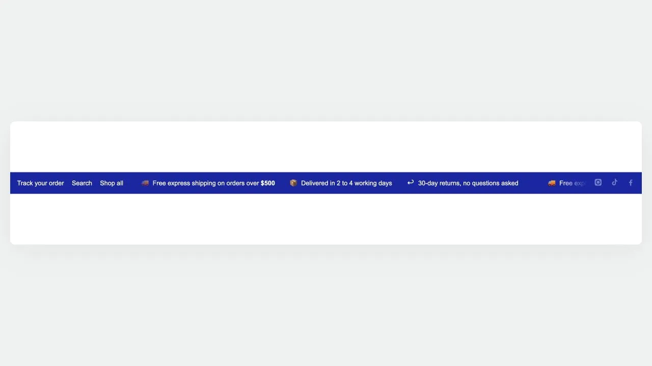 Free
Free Utility Bar 1
Headers & Navigation
A three-zone top rail: quick links on the left, a scrolling message in the middle, and country, language and social links on the right. Only the middle moves, so the links and the country picker stay clickable. The softer divider tone is worked out from your text colour and measured against the background, so recolouring the bar cannot quietly drop it below a readable contrast.
View section →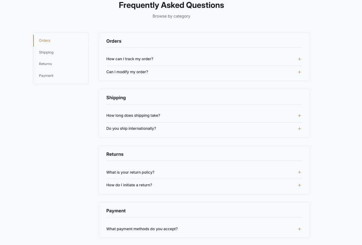 Free
Free FAQ Side Navigation
Headers & Navigation
FAQ with left sidebar navigation for categories. Sticky sidebar with category links, smooth scroll to sections, and active state highlighting on scroll.
View section →