
Shop Collections 4
Shop Collections 4
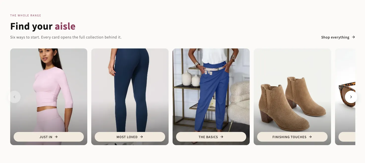
A rail of photo cards with a button sitting on each one. Every colour that ends up as text — including the button's hover state — is measured against the surface it actually lands on. Arrows sit over the cards or in the header.
- Price
- Free
- Category
- Collection Showcases
- Merchant installs
- 17
- Works with
- Any OS 2.0 theme
Installs via the Section Shop app · shows as “SShop:Shop Collections 4” in your editor
- collections
- categories
- slider
- rail
- photo cards
- button
How to add Shop Collections 4 to your store
- 1
Install Section Shop
Get the free app from the Shopify App Store — takes one click.
- 2
Add “Shop Collections 4”
Find it in the Collection Showcases category and click Add to theme.
- 3
Customize in your editor
It appears as “SShop:Shop Collections 4” — edit text, images, colors and fonts, then save.
More collection showcases sections
View all →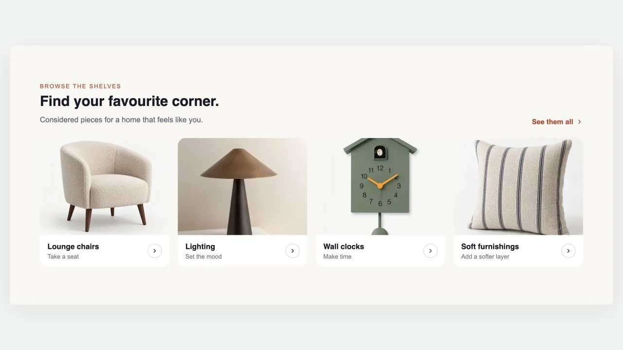 Free
Free Collection Grid
Collection Showcases
Replaces your theme's own product grid on a collection page: products, sorting and pagination, with the caption rows built from blocks you can reorder or remove. Every card in a row shares an identical height, photo bottom, name top and button top, because the vendor and rating rows are decided once for the whole grid rather than card by card.
View section →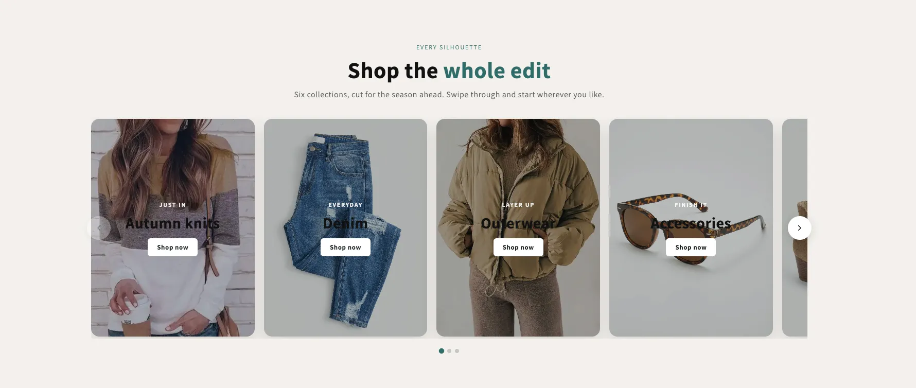 Free
Free Shop Collections 7
29 installsCollection Showcases
A rail of full-bleed collection cards with the copy laid over the photo, positioned in any of nine spots — set separately for desktop and phones. Optional autoplay, dots and arrows, each toggled per screen size.
View section →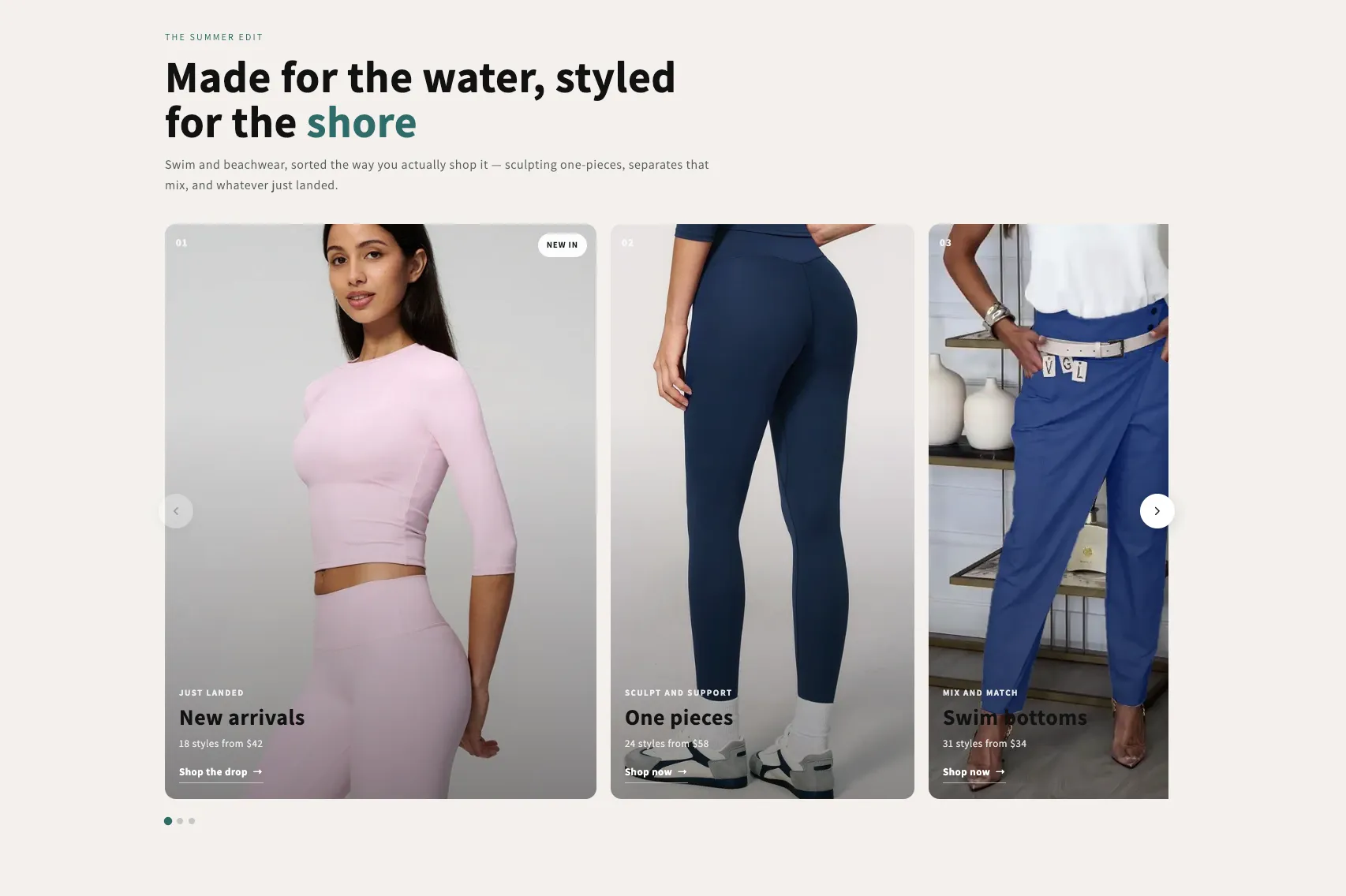 Free
Free Shop Collections 6
19 installsCollection Showcases
An editorial rail of collection cards with a numbered index, a badge, a kicker, a title and a meta line over a graded photo. One grade across mismatched photography makes the set read as one. Optional autoplay with a real pause control.
View section →